Brutalist/Punk/Anti design
Brutalism is originated as an architectural style which was used to create building structures from 1950s up until early 1980s. However, it is a popular design style among graphic designers today. Firstly, brutalist design is intended to portray message to the audience efficiently and with purpose by stimulating the reader’s focus on the specific topic. It is intended to portray the message straightforward in which many other creative, funky styles tend to do the opposite. Brutalism in graphic design uses large, bold typography which can be implemented with some images, the use of large typography is intended to standout and be straightforward.
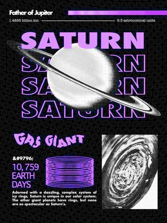
This is an example of a typical Brutalist design, we can clearly see how this example communicates the message effectively as it sticks to it’s purpose. We can see that everything in this design revolves around the topic of Saturn specifically which is made quite clearly through this brutalist style. The large typography of ‘Saturn’ which is presented multiple times with the Saturn is what makes this design standout to the audience as it evokes the importance through size and composition of these elements. What we also see with brutalism is that this design style sort of trying to bring back retro design aspects, for example in this design we see elements such as the Saturn in black and white which gives off a retro feel.
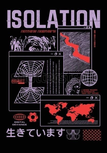
This another example of brutalist graphic design, like this example and the previous one we could clearly see brutalist graphic design style is similar to minimalism in terms of layout and composition, the only obvious difference is that minimalist design tries to portray the message with as minimal detail as possible whereas brutalist is the opposite. In this example we can clearly see how much information and detail is put into this design to make the message stand out and be relatable as much as possible. We also notice that the colour scheme for brutalist design is very neat with no more than three colours being used, the chosen colours also work well together on a black background.
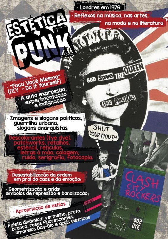
Punk design style is simply portraying a rebellion feel as this style’s purpose is to go against any design rules and structure that may apply to a ‘good’ design. As we can see in this example, punk art consists of a ‘messy’ layout as everything seems to be all over the place with the use of many different colours, typography and no structured composition which breaks the conventions of a good graphic design piece. In this example we clearly get the sense of a rebellion feel as there is so much freedom and expression within this example, which is what punk design stand for. In this example, there are five different types of typography used with no structure or organisation as they are spread across the whole piece in different colours.
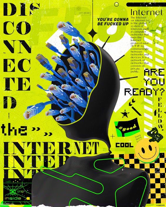
Anti design just like punk design is an expression of rebellion withing design by presenting a design piece not following any design conventions yet still portraying a strong message to the audience effectively. In this example we clearly see a message portrayed about disconnecting from the internet and how much this could affect the current society. The whole message is portrayed in a chaotic approach with a variety of different typography and detail used across the whole design. The design piece might not look aesthetically pleasing to many but that is the point of anti-design, the main priority of this style is not for it to be aesthetically pleasing for the audience and instead expressing emotion of rebellion.
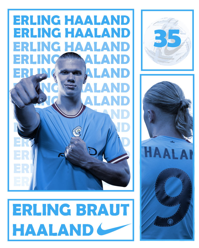
This is my brutalist design of Erling Haaland, the main purpose of this style is to communicate the message effectively and stick to it’s purpose. I tried achieving this through an effective, organised composition that can be seen in my research examples. I’ve used a simple box layout to communicate detail about this specific player such as his name, team through the colour and how many goals he has scored. I’ve indicated his goalscoring record through a low opacity football in the top right corner with his record.
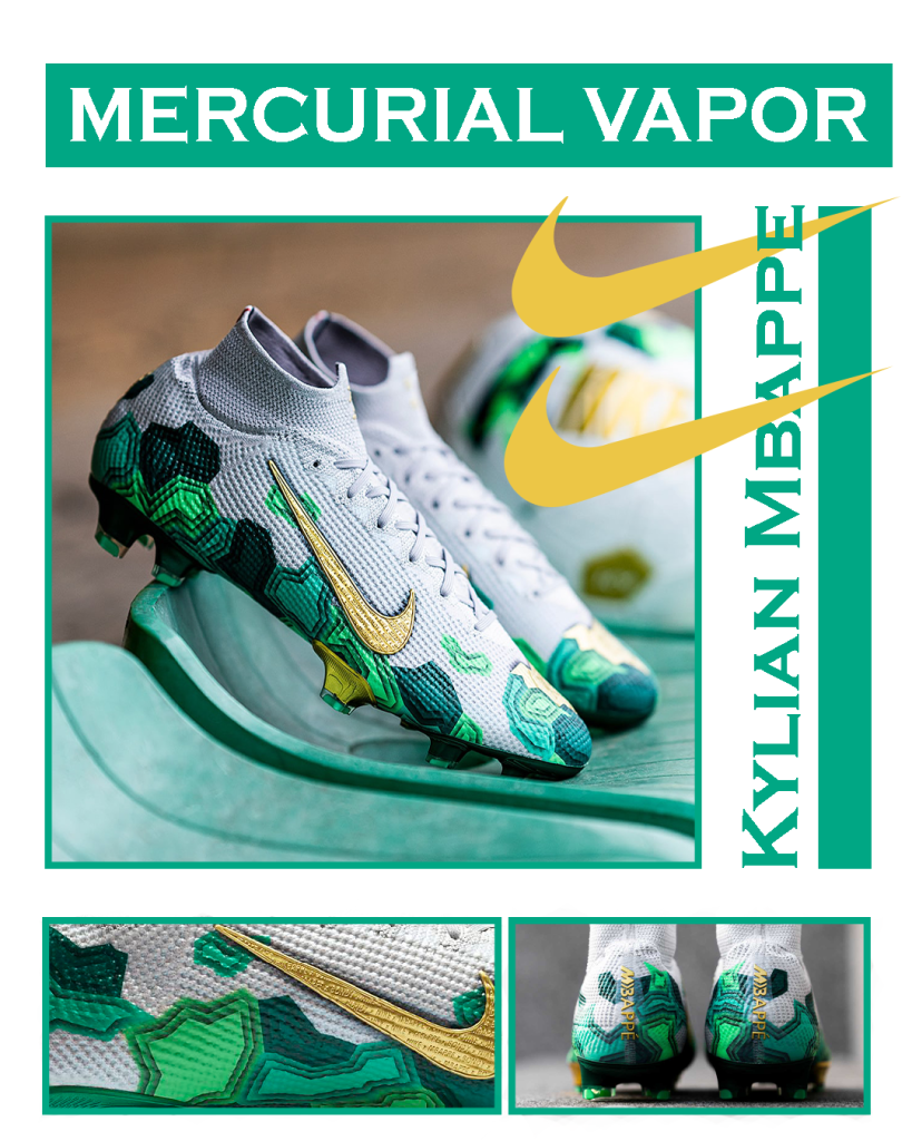
I’ve applied the same approach to this design as the previous one, I’ve based this design on Kylian Mbappe’s boots and created this brutalist design consisting of pictures from the official photoshoot for when the bots were being released.
This is my design inspired by anti-design which consists of no specific design rules and gives you freedom to express anything through a design piece. Personally, I’m not a fan of this style however I’ve used the research knowledge to come up with this design that uses variety of different fonts for typography with no real composition. However, I’ve kept the colour use minimal.
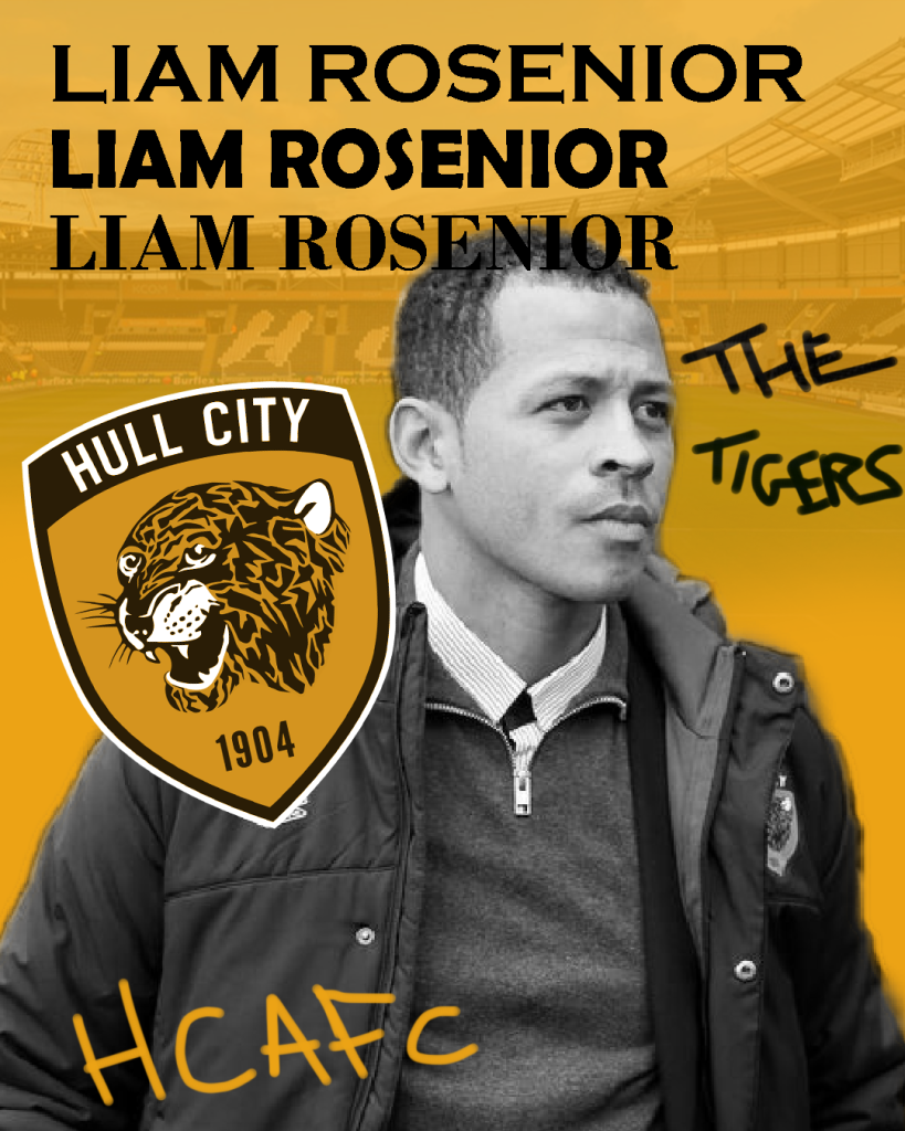
This is another anti design I’ve created based on Hull City’s manager Liam Rosenior. Just like the previous design I’ve used variety of different fonts for his name and brush tool to create a handwritten effect across the design.