Minimalist Design
Minimalist design is the use of simplicity to its power making simplicity look effective and good on the eye. The idea of minimal design is in its name, using as the minimum to create an effective artwork. Minimal design uses lots of white space effectively meaning that not every space has to be filled in but leaving sections blank creates this unique and neat style which is what it’s known for. Rather than including glamourous illustrations, minimalist design is made up of well-structured and composed typography that can vary across the design as well as different details like shapes all used in a simple, consistent way.
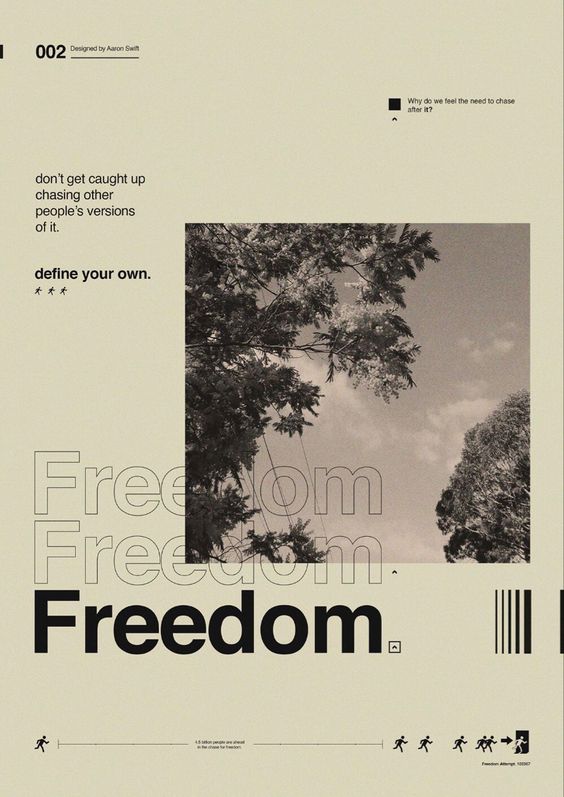
Here is an example of a typical minimalist design piece, as we can see there is nothing going on that may catch the viewers eye straight away as everything is presented in an elementary, simple manner. We can clearly see the design is made up of simple typography, few simple details and one photographed image which is composed in a neat, efficient way as the space left on the outside is quite even due to the use of effective composition. Most importantly the typography is in line with each other, what also makes this simple design effective is the use of different typography and size throughout the design. The colour throughout the design is also consistent as the black font is used on the creamy background whilst also having a black and white photo which all blends and works well together due to having a similar colour tone. Finally, the small details used at the bottom of the piece add some spark to the overall design.
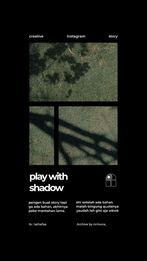
This is another example of an effective minimalist design which is consistent, neat and simple. This design in particular stands out for the way the photographed image is split into a three-section grid, this gives the design a simple yet creative layout but still serves it’s minimalist purpose as each grid section is in line with each other. The composition of the typography is consistent throughout as it is all in line with the rest of the sections which is kept in the centre of the piece. We also notice the difference in typography as some of it is more bold and bigger in size than the other, meaning bolder and bigger text may have something more to say and be the focus for the viewer. The typography above the photo is spaced out neatly and in line as the rest of the space is left untouched creating negative space which keeps all the elements grouped and connected in the centre of the piece.
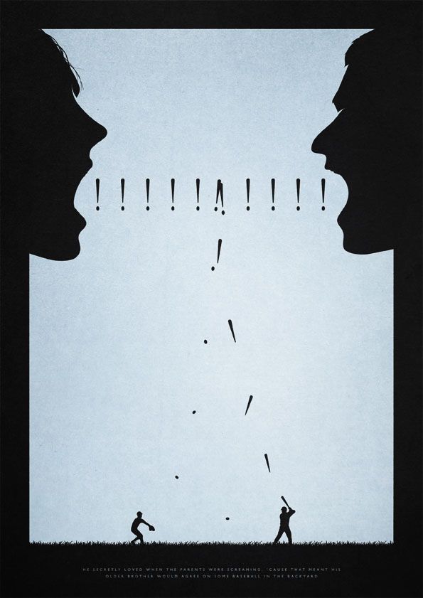
This is a minimalist design that is slightly different to the previous other two, however the same concept applies. This design barely uses any typography and instead portrays it’s message through a simple conceptual design. Just like any minimalist design we see the effective use of negative and white space that is manipulated to portray the message and focus the viewers’ attention in the intended manner. The negative space around the outside of the design forms the two faces in a clean, smooth style. We also see the effective use of negative space at the bottom of the page as it translates into a patch of grass where two individuals are seen playing baseball. This minimalist design is also more creative than usual ones as the exclamation’s marks are portrayed through an act of a baseball game happening at the bottom section of the design.
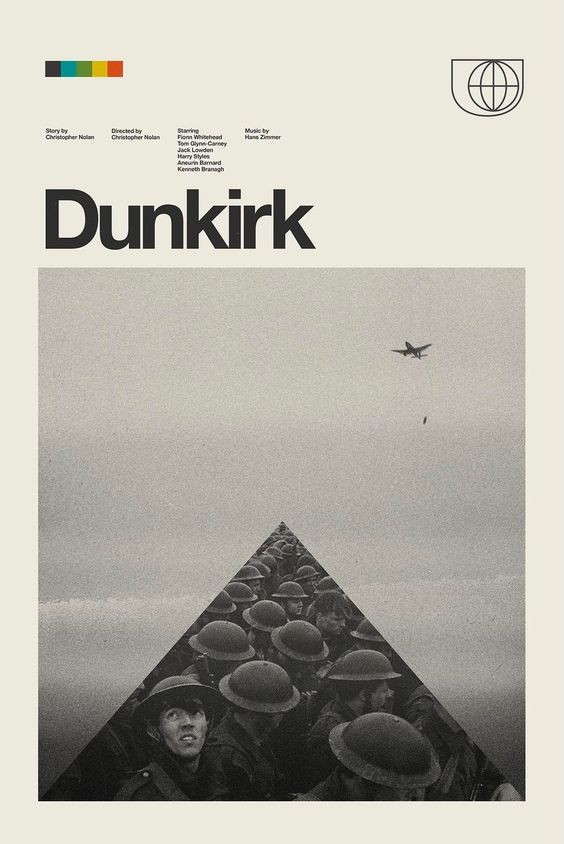
This is an example of a minimalist design that focuses on the topic of Dunkirk which was a battle fought in the second world war. Just like most minimalist designs we see an effective use of simplicity and composition within this design. The line of soldiers is effectively portrayed centrally creating an illusion of the never-ending line of soldiers.
Here are some designs I have made inspired by the minimalist style, after researching and talking about my found examples of this style I have understood the convention and it’s purpose which I have managed to apply in my own work. For my designs I have used my own photos that I have took myself as I believe they work well with the minimalist style.
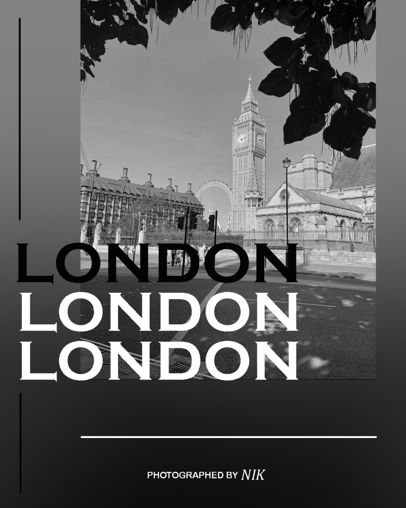
This design is based around London as I really like this photo I have took whilst visiting and thought it works well as a background, for this design I took inspiration from the first minimalist example as the ‘London’ typography is repeating itself with the same font size and style keeping simplicity of minimalism yet also showing some creative spark with one of them being a different colour to the other. I also used the gradient as it creates a neat effect with the black and white colour of the design. Finally, to add a bit more to the design I’ve added some lines making sure they’re compositionally neat which we see a lot of these type of details in minimalist designs.
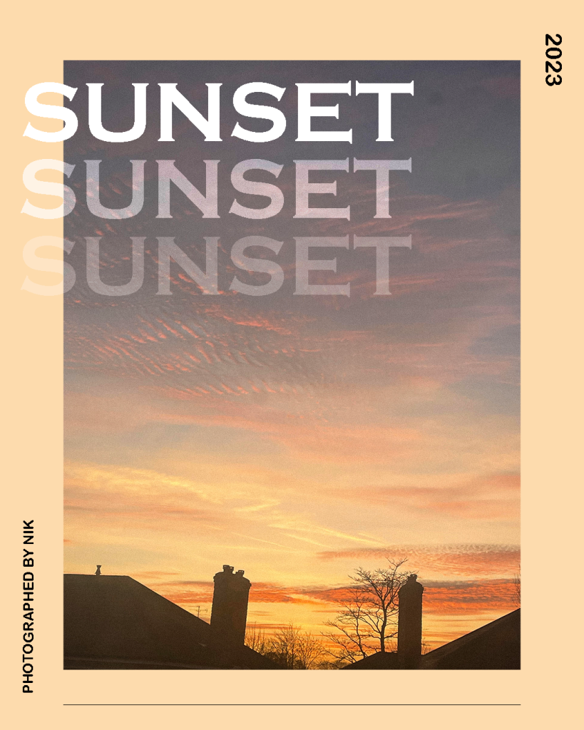
This design is similar to the previous one with how everything is structured and portrayed, for this design I’ve used a photo of a sunset making the overall design layout brighter than the previous one, you could see I’ve also applied the repeating typography for this design however I’ve created a fade effect with the ‘sunset’ typography.
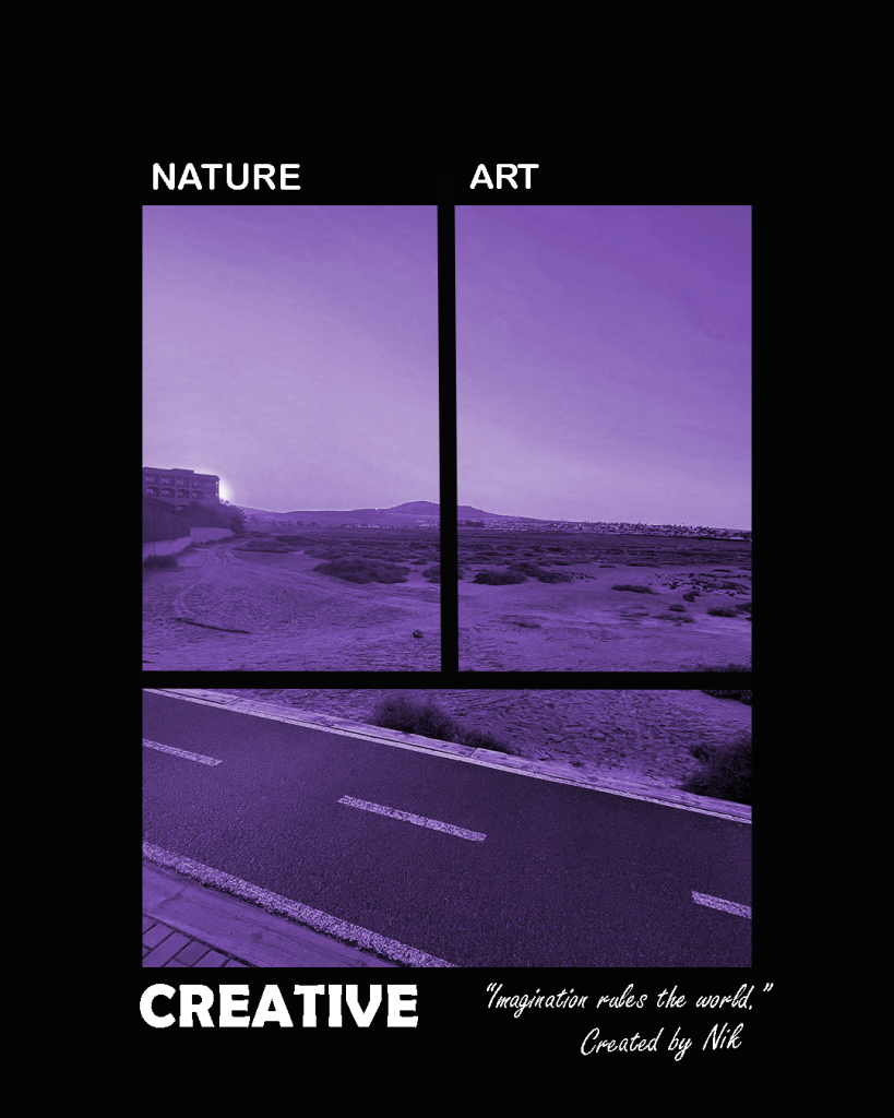
For this design I’ve took inspiration from the second minimalist example which includes an image split into three sections with very few texts included, this portrays simplicity which is the key aspect of minimalism. The typography I’ve included are simple words that associate with this artwork, in addition I’ve included a design quote in a different font to make this piece a bit more engaging but in general I’ve kept everything minimal and simple.
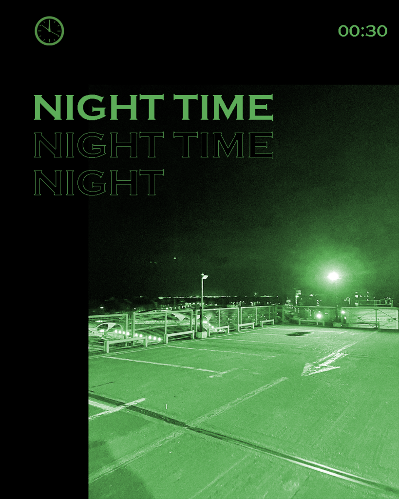
Lastly, for this design just like the previous ones the structure of the layout is similar. For this design the focus topic is ‘Night’ as I’ve used a photo of an empty parking lot which evokes a sense of isolation.