My editorial topic is Sports, more specifically football.
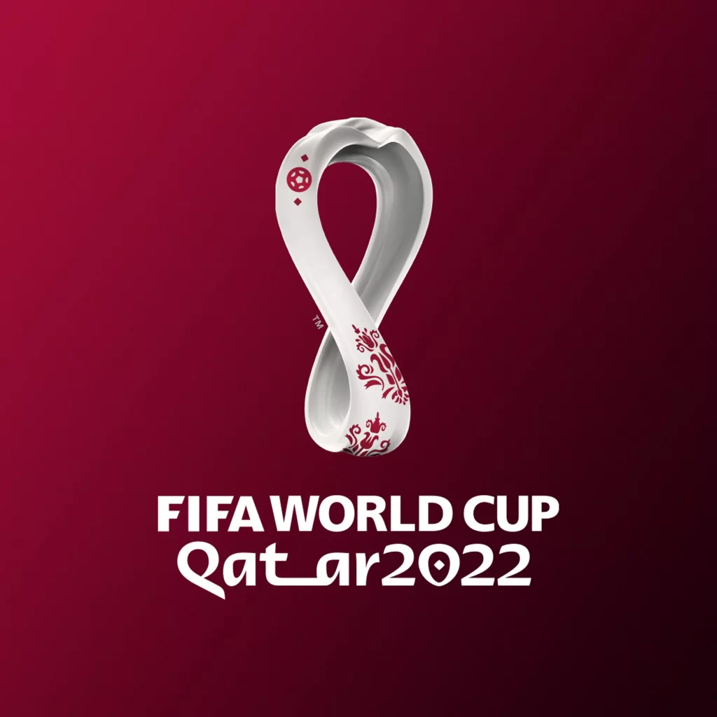
Typography in football is influenced by the background of a certain competition, the world cup competition is a great example. Everytime world cup is held in different countries and continents, meaning the designers of the competition’s logo are responsible to implement a country’s culture when designing the logo which will represent the country where the competition is being held and football itself. We can see a good example of this in the logo of an upcoming world cup which is being held in Qatar.

This is a good example as the culture has been implemented successfully through colour, small image details and the typeface. Firstly, the typeface of the text ‘Qatar 2022’ is presented in a font that replicates the culture language of Qatar. Qatar uses arabic language therefore the arabic font is simply replicated into english which portrays the culture effectively within the logo. The small image details presented on the trophy concept also implements the culture effectively as we can clearly see the small details are symbols associated with the culture of Qatar.
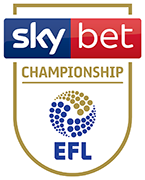
Here is a bad example of typography within a 2D design graphic, throughout my research, I have investigated a variety of football league competitions logos. As I’ve already discussed effective examples of typography within the football industry this is a design that I think has a bad use of typography. Firstly, this is a design for an English 2nd division competition the ‘EFL championship’. We can see there are three different texts within this design in which each uses a different typeface font which represents the sponsor of the league, organisation and the actual name of the league. One of the reasons I think this design doesn’t have an effective use of typography is because the actual name of the competition ‘championship’ doesn’t stand out for the reader whilst being the most important text in this design as it represents the competitions name. One of the reasons the ‘championship’ text doesn’t stand out is mainly the size and the font of this text, as we can see it is very small and hidden from the reader more than the other two texts within the design, in my opinion, it should be the largest in size out of the three different texts in this design. Similarly, another reason this design portrays bad example of typography is the use of variety fonts that I don’t think work well together, as we can see different fonts within this design don’t work well together as it doesn’t make the design look neat and stand out to the reader. This is also because when there is a variety of different fonts used in a design, it makes it hard for the reader to focus on a specific text. Lastly, I think this isn’t an example of effective typography because of the lack of creativity, the text isn’t positioned in a engaging and effective way that would grab the e readers attention mainly because the spacing and difference between each text makes it look separate rather than being part of one design.
I have proceeded to redesign the bad example of typography within the football industry by redesigning the EFL championship logo. As you can see I have tried to address the issues with the original logo when redesigning it. Firstly, I wanted to make sure the typeface of ‘Championship’ will stand out clearly for the readers as the original design doesn’t achieve this. Therefore, I’ve used a bold font for the main typeface of this design, I’ve also made the typeface much larger in comparison to the original logo as it comes through the outline of the logo whereas in the original design the ‘championship’ typeface is kept inside the logo outline. However, I’ve decided I could make the typography look more articulate having the ‘championship’ typeface break through the outline yet still be presented in a tidy manner only having 2 letters from each side leaving the outline of the logo. I’ve also made small gaps on each side of the outline where the text cuts through to make everything look intentional and neat making the overall logo look smooth and professional. Whilst focusing on redesigning the typography of the logo, I have also redesigned other aspects such as colour and composition. I removed the golden colour from the design and only only included red and blue as the gold colour doesn’t work well with those two.
References