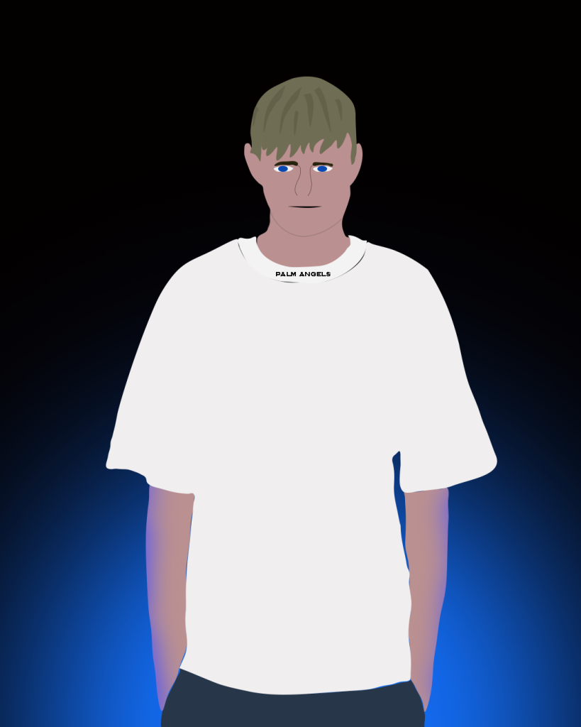
This is my photoshop self portrait which I have constructed myself using different features. Firstly, I have chosen a picture of myself from when I was on holiday as this was one of my best pictures where I am standing that could be used for a portrait. For this portrait, I have mainly focused on making the image look enhancing through the use of colour and lighting. Firstly, I have used the pen tool to create an image of myself, filling in different sections with the appropriate colours. When crafting the hair, I’ve used other shapes with a different colour shade over the top of the overall hair mask to create volume making the hair look more realistic. To make the structure of the face look sharper and more real I have added a stroke between the neck and the jaw, I’ve also made sure the stroke is of a darker colour shade compared to the skin so that it blends in with the skin but at the same time it shows the outline of the jaw making the face structure look sharper making the overall portrait more detailed. The white shirt I am wearing has a label on the collar which I have included by typing out with a type tool and using a similar font to the original label. Finally, to make this portrait enhancing and interesting, I have decided to create a glow effect which shows the light projecting from the bottom as it adds reflection to my arms. Blue being my favourite colour as well as my eyes being blue, I’ve decided a blue light projecting from the bottom of the portrait on a dark, black background will add a sense of luminosity and making my presence intriguing and less dull compared to what a basic portrait may be.

This is my second photoshop self-portrait. Just like the previous one I have made the same approach focusing on enhancing the colours making the overall design glow. I’ve also used the same illustration style like my previous design. However, for this portrait I’ve used a different type of picture in which I am standing facing sideways holding a football, this portrait is very basic yet demonstrates an image of myself and my hobby alongside some spark of flair with the colours projecting from opposite corners. To add creative spark, I’ve decided to include two colours that bond well together projecting from opposite corners. Just like in the previous design, I wanted to portray these projected colours through a reflection onto the illustration of myself, which indicates a projected blue and purple lighting which makes this portrait visually interesting. To make the colour lighting really stand out I’ve made sure the background is pitch black as glowing colour is visually projected well on black background. To make everything more sharper and clearer I’ve outlined areas indicating where my arm is, then also adding improving the texture on my face and hair with basic lines, this could also be seen with the texture added to the football. Most importantly, this portrait looks more like me compared to the previous one.