Brand Development
Whilst undertaking my research, at the same time I was developing and experimenting with the brand’s logo, name and concept shirt designs with a goal of finding a design that clearly portrays the brand identity but most importantly is aesthetically pleasing, as visual representation is one of the main reasons people get attached to specific clothing brands.
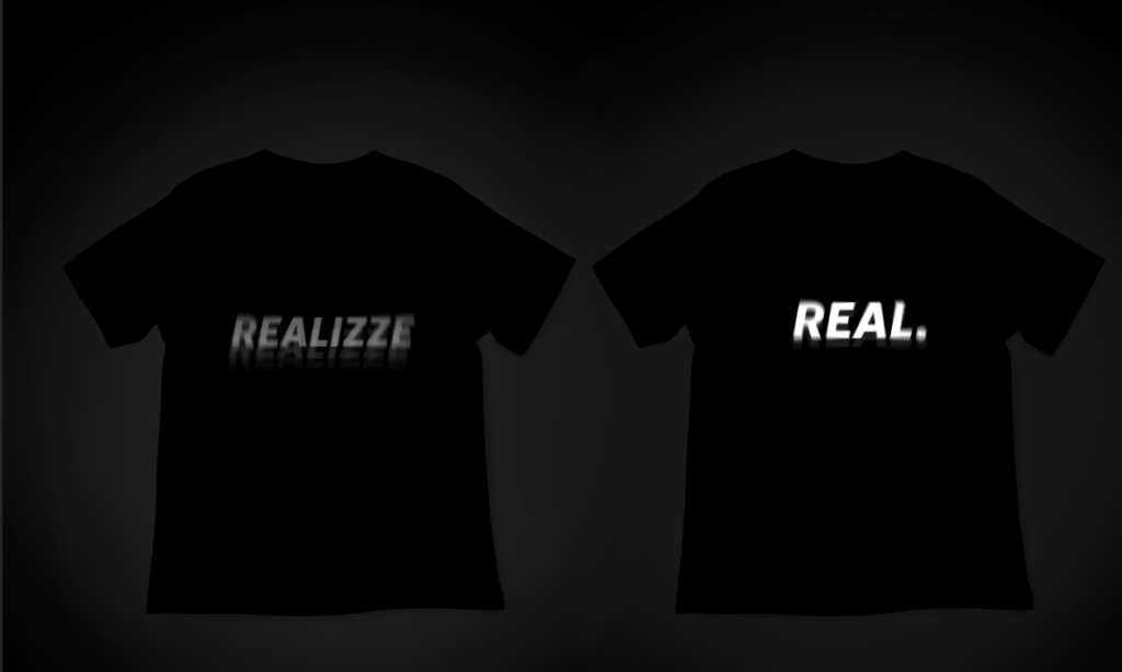
‘Realizze’ clothing was the first brand concept I’ve come up which revolves around being out of touch with reality and derealization which is commonly associated with the Gen Z culture. This concept has been heavily inspired by ‘anti social social club’ who built connection with their consumers through a niche that revolves around introvertness which meant a lot of introverts can resonate with the brand as I’ve mentioned in my research.
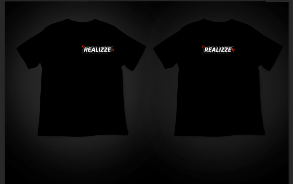
As you can see I’ve created and experimented with a variety of logo designs using Photoshop. The brand logo was a simple text with minor effects and emoji’s alongside the text in other versions. As you can see, I’ve experimented with effects such as shadows and blurriness, as the spin blur effect makes the text look slightly distorted which represents the narrative of dissociation and derealization effectively. As you can see through the shirt designs, the style is very minimalistic, which isn’t necessarily a negative when it comes to clothing brands, as there are majority of successful brands that pursue a minimalistic style, however, majority of these brands incorporate minimalism in a way that makes them stand out, such as a simple illustration with a strong meaning behind it. For example, Nike has a very basic but unique tick logo that is recognisable globally for many years, what makes it’s minimalistic design so valuable is that their simple logo design has become a pivotal identity in sports specifically. Going back to my brand concept, I felt like ‘Realizze’ was too minimal and that I needed to create a unique illustration to make my brand feel different, because just having simple text like I have with ‘Realizze’ concept doesn’t quite achieve this and can be easily seen as very familiar to other brands that are represented by a singular text.

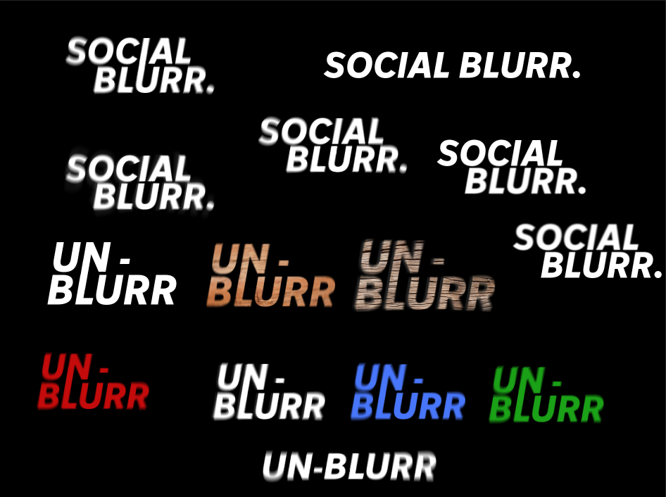
This moves me onto my next concept in which I’ve adjusted the brand identity from purely revolving around the topic of derealization and dissociation to a general Gen Z social crisis and similarly to how people are dissociated from the real world caused by the rapid increase of social media usage. Therefore, to portray this narrative within my brand I was coming up with a new brand name and mainly experimenting with the layout, composition and texture of typography.
As you can see, I’ve had two new ideas for my brand name with it being ‘social-blurr’ and ‘un-blurr’ and creating multiple variations which I’ve then placed on concept shirts in photoshop, comparing different styles and deciding which design style looks better on the eye. Both name ideas have ‘blurr’ in them, as I think the distorted, blur effect incorporated in the text really portrays the image and feel of dissociation. I’ve experimented with the wooden texture for the ‘un-blurr’ concept, as the message behind the name is basically encouraging the society to ‘un-blur’ their reality which you can argue has been mainly blurred by social media, making it easier for people to communicate with each other without having to socialise in person. Therefore, the idea behind the wooden texture was to symbolise the importance of stepping outside into nature, in which I would incorporate the brand’s photoshoots based around nature and wooded areas.
Established idea
After spending many hours experimenting with variety of design concepts, I’ve finally come up with a logo design that I’m satisfied with but most importantly an identity that portrays brand’s message effectively, at the same time presenting a streetwear style which is trending among the Gen Z as mentioned before in my research, as they are the main target audience in this project. Firstly, I’m going to elaborate on the development of my established idea, such as the thinking process behind it and the execution of the brand’s creation.
After a variety of ideas for the brands name I’ve decided to go with ‘Un-Blurr’ as I’ve mentioned before, it demonstrates the brand’s values and meaning effectively through the idea of encouraging today’s society to ‘un-blur’ themselves and step out into reality. To demonstrate this message further, I wanted to create an illustration alongside the text to the shirt design, as I’ve mentioned earlier, an illustration that goes alongside a simple text can enhance the overall brand and make it’s identity much more memorable and unique in a way.
I’ve began brainstorming a variety of ideas for a tee shirt design, as I wanted a simple yet an eye-catching design that gives the overall product personality. As this is a streetwear brand, I’ve attempted to incorporate a specific style associated with streetwear clothing. Streetwear clothing style commonly expresses freedom, creativity and artistic elements, as it’s seen as chilled out rather than a formal style. Therefore, I’ve attempted to incorporate cartoonish styled illustration to portray the brand’s identity through a streetwear style.
I wanted the shirt illustration to portray the message of today’s crisis in socialising through a minimalistic yet creative style, in which people are able to identify the brand’s message to an extent. I’ve decided to create a simple illustration of a melting iPhone, which elaborates on the brand’s message encouraging society to put their phones down and step out into the real world. I’ve created this simple, melting black and white iPhone illustration in photoshop using the pen tool, as I first created an illustration of a blank iPhone and created melting effect using the same pen tool method at the bottom of the first illustration, combining the two.

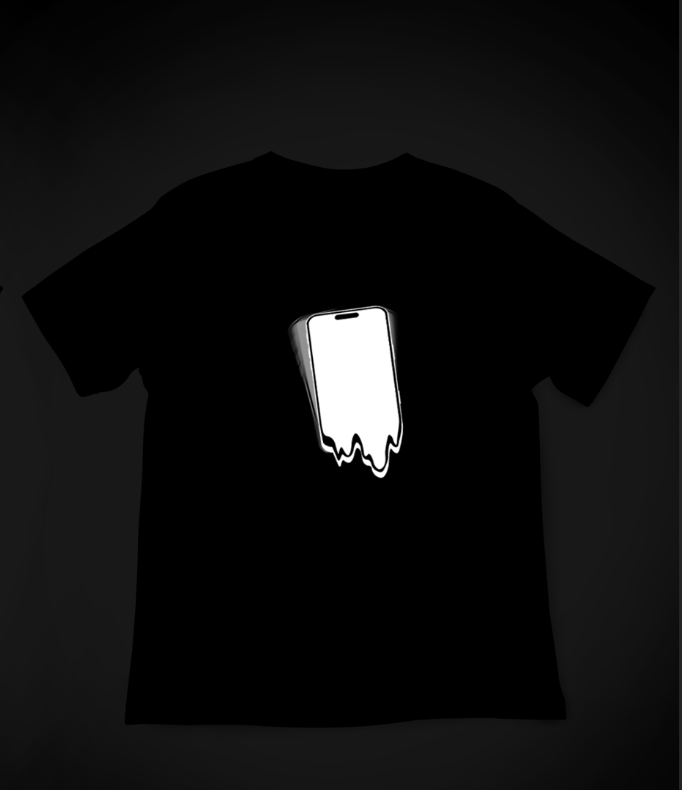
After being pleased with the first attempt at the design, I was experimenting with how the illustration will appear on the tee shirts, mainly focusing on the positioning. Here is my first concept of the shirt design with the brand-new illustration, as you can see, I’ve decided to tilt the illustration slightly and add some distorted, blurred shadows as I feel like it adds more character to the design and the blurred, distorted style works perfectly with my brand’s niche and streetwear style in general. However, I still felt that the shirt still felt like it was missing something, so I’ve decided to incorporate the brand’s text, afterall the text is essentially the brand’s main identity as it plays the role of a brand logo. Hence, I felt it was important to incorporate it into my tee shirt design, as the brand name alone portrays the message I’m trying to push with this brand.
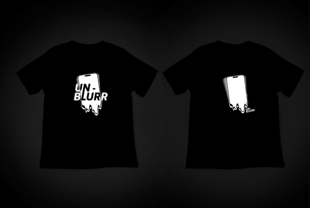
I was then experimenting with the positioning of the ‘Un-Blurr’ text as I wanted to incorporate it alongside the melting phone visual, I’ve come up with multiple tee shirt designs trying to ensure that the text works well with the visuals, as composition is a crucial aspect when it comes to design, especially in clothing, speaking from my personal preference I would not purchase a clothing item that has visuals looking out of place. Keeping the large visual centered, I’ve created these two concepts, in which I’ve incorporated the text in different styles for each concept.
For the concept design on the right, I’ve made the text very small, placing it on the side below the phone visual, also tilting the text so that it’s in the same position as the visual and doesn’t look out of place as I’ve mentioned the importance composition, being one of the key aspects in design.
I’ve taken a different approach for the concept design on the left, by merging the text with the phone illustration, only problem I had with this is that parts of the text would not be visible whether it was in black or white, as it would either overlap with the black tee shirt or the white illustration, hence I’ve come up with a solution that not only solves this problem but makes the text seamlessly connect with the illustration, enhancing the overall visual aspect of the shirt. To achieve this, I simply applied changes to the colour, making parts of the text the opposite colour to the background colour of where the text lays, creating a blend effect on the typography and making it clearly readable. I could have had the text a completely different colour to white or black, however, I decided to stick with a minimalistic choice, only incorporating two colours, as simplicity and minimalism has advantages when it comes to fashion, with one of the advantages making it easier to mix and match your product with other clothing products.
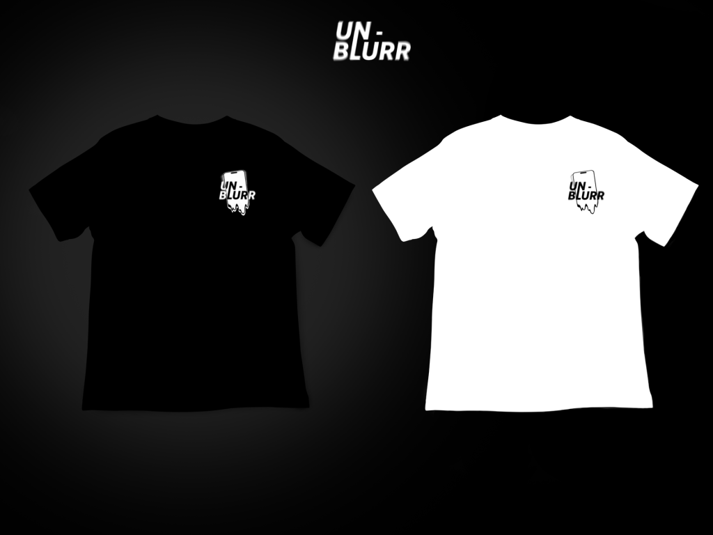
Looking at these concepts, I felt like the illustration was too large and could potentially work better when minimised, I decided to stick with the design idea from the concept shirt on the left, and experimenting with the placement and sizing of the shirt illustration. In addition, I wanted to add more variation, hence I’ve created a white tee shirt alongside the original black shirt, keeping the colour scheme minimalistic. The reason for the chosen colours of white and black is that they’re proven to match well with many other clothing, providing great balance and minimising risk in a sense, as it’s slightly more complicated to mix and match clothes in brighter colours. Furthermore, the black and white colour scheme works effectively with the brand’s niche, with the dark, simple, generic colour scheme being associated with a darker mood, fitting in with the narrative of the Gen Z social crisis and dissociation with the real world.