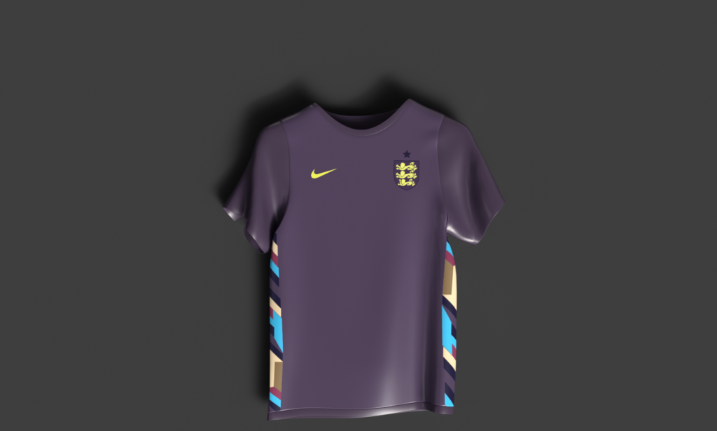
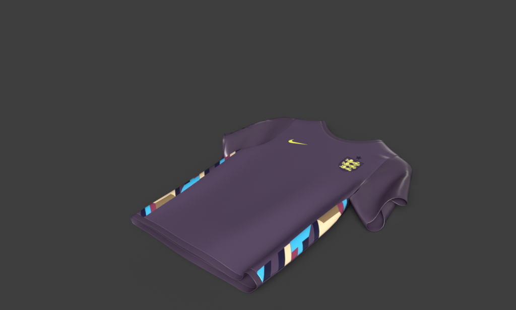
To bring my products to life I’ve applied texturing through designing UV’s in photoshop and then applying them onto my products. UV is important in 3D modelling when applying detailed design texture onto 3D models, it is essentially a process of designing a 2D texture that is then implemented onto a 3D product. When creating the UV texture for the shirt, I’ve had a photoshop file with series of assets that I have created, the reason for creating UV’s in a 2D photoshop file is that it simply allows me to illustrate, edit and plan out assets carefully and in detail.
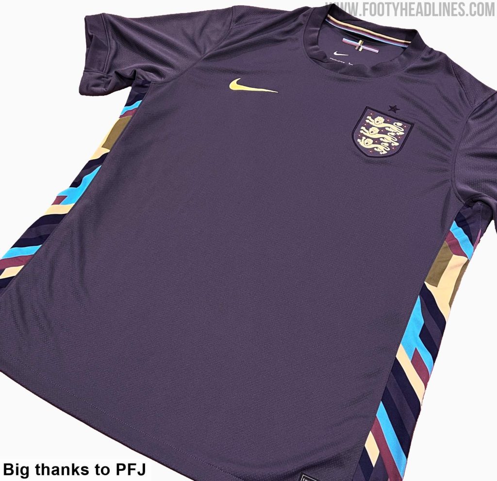
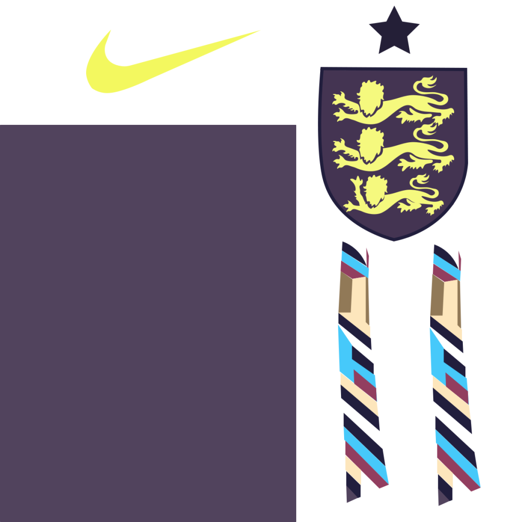
So, the first product I was going to apply texture design to is the shirt as I’ve decided to incorporate England’s away shirt as one of my brands mystery shirt product.
Footy Headlines. (n.d.). What’s The Actual Color of England’s Euro 2024 Away Kit? [online] Available at: https://www.footyheadlines.com/2024/01/whats-the-actual-color-of-englands-euro-2024-away-kit.html [Accessed 11 May 2024].
Here are my finished edited UV assets for the shirt, to create these assets I have used England’s official away jersey to illustrate the shirts side pattern made up of random colours and shapes. I’ve created two of these one for each side of the shirt. I used the pen tool to create the shirt patterns as well as the England crest and the Nike logo that are all features of the shirt.
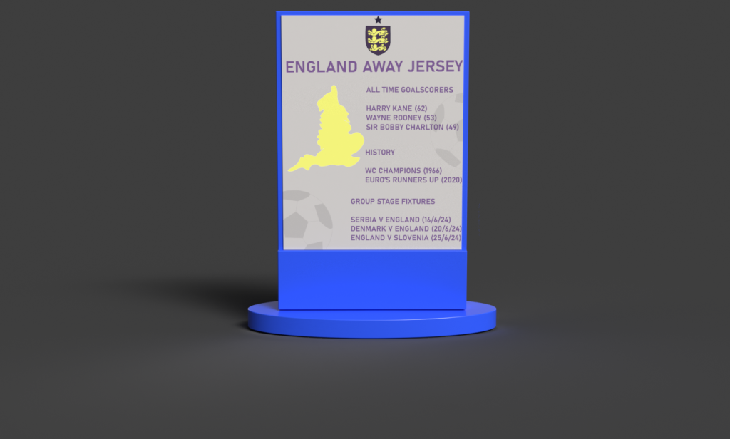
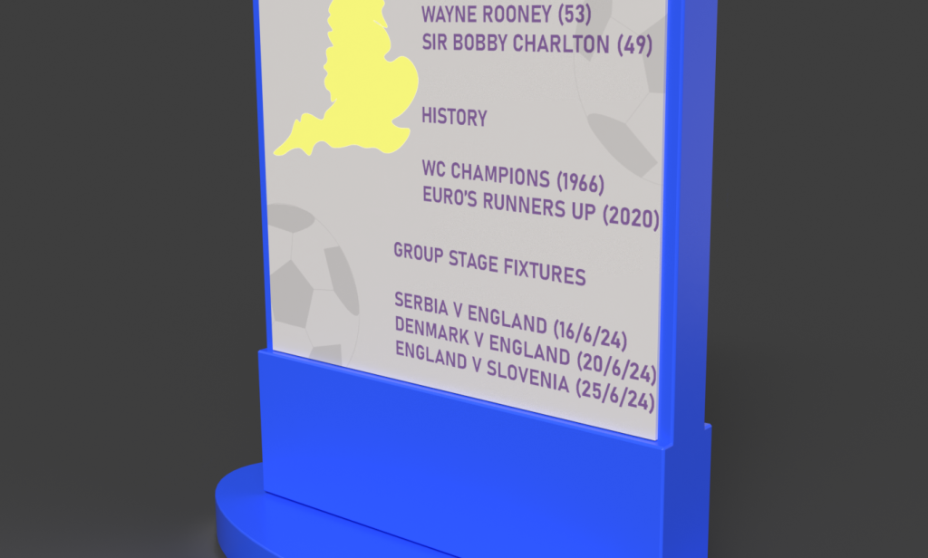
I then applied texturing to an information sign that comes with the shirt to give the buyers context behind the product they’ve just unboxed. When adding design texture to the sign I’ve ensured that it gives the buyers context behind the footballing nation which in this case is England. To represent the nation,I’ve included a geographical illustration of England from the map on the left-hand side, whilst incorporating typography on the right-hand side. The typography consisted of the nation’s footballing history and statistics such as silverware, all time goals scorers and group stage fixtures for the forthcoming campaign. In terms of colour I’ve used blue as the base colour which is the primary colour of the overall branding, however for the content such as typography and illustrations I’ve used the main colours of the jersey which in this case is yellow and a shade of purple, as the sign is linked to the jersey I ensured to enhance the visual connection through colour and additional branding assets that you can see on the mystery box such as the low opacity ball illustration.
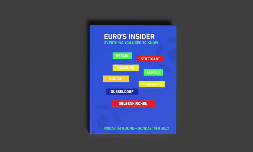
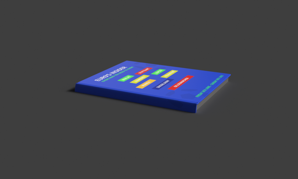
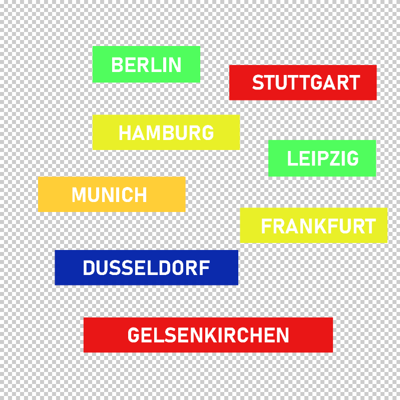
The final product I’ve applied texturing to was a guidebook that focuses on everything to do with the competition, similarly to the previous products I’ve incorporated the same design styledemonstrating consistent colour and typography. As this year’s euro campaign is hosted in GermanyI’ve included all the cities hosting the fixtures at the front of the guidebook. For this I’ve created a UV in photoshop so I could ensure neat composition and spacing between each block of text for the cities. The use of colour was again inspired by the tournament’s official colorway.
To create the UV, I’ve used a transparent background in the phototshop file so that I can important the into Substance painter as a Png.