I was assigned to create a brand-new energy drink brand for a specific target audience individual of the age range 60+. I’ll need to take a different marketing approach compared to the standard marketing approach we see around energy drinks as they are usually open in terms of age range being 16+ in the UK. However, for this task I had to take an approach that appeals and is appropriate for elderly people only.
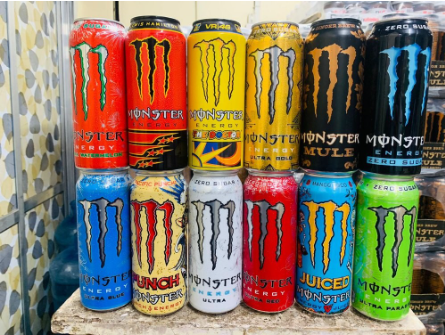
I have started off by analysing the existing energy drinks branding and their marketing aspects such as colour and typography and how that’s used to appeal to customers. Here below we see all the different flavours of the famous energy drink brand Monster, I’ve noticed the rich use of bright vibrant colours used to appeal to customers with some additional design elements on the cans making it seem like a ‘fun’ drink to consume.
IndiaMART. (n.d.). Monster Energy Drink - Latest Price, Dealers & Retailers in India. [online] Available at: https://dir.indiamart.com/impcat/monster-energy-drink.html [Accessed 7 Mar. 2024].
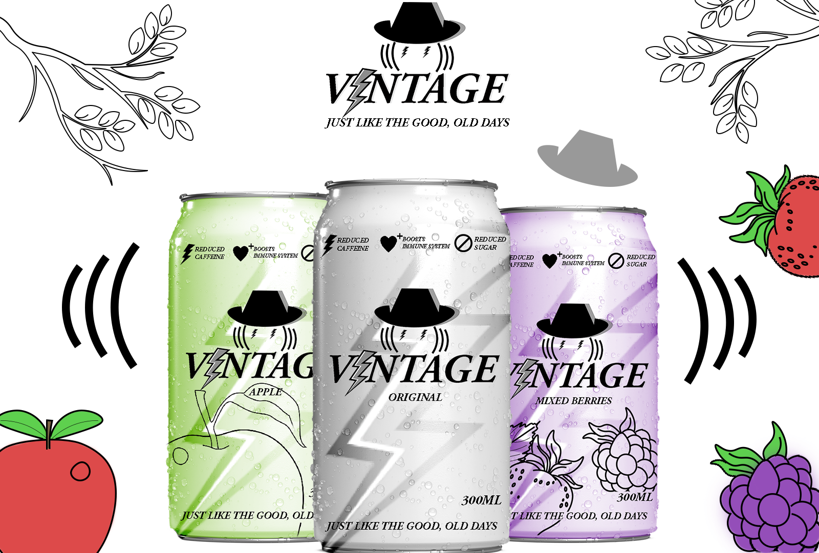
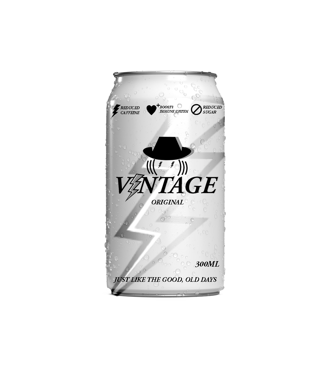
However, in this section I’m more focused on the brand logo design before focusing on the final packaging. The first stages of planning was to come up with a brand name, I’ve done this by listing all the words linked with energy drinks on one side of a page and all words linked with elderly people on the other side to hopefully come up with an effective name combination. Finally, I’ve decided to keep it simple and go with the brand name ‘Vintage’ which is simply a term used to describe something of age.
I then applied the term into a conceptual logo idea, here are the logos being presented in three different styles. I simply started off with the typography using this specific font as it gives off an old fashioned, vintage feel. I then replaced the letter ‘I’ in ‘vintage’ to a lightning symbolising energy which is commonly used on energy drinks packaging, however I’ve made it appear in grey, black and white to keep it in a vintage style alongside the rest of the letters being in black with a grey shadow in behind the letters. After establishing the typography aspect of the logo, I then moved on to creating a basic illustration of a face with an old-fashioned cap which enhances the vintage style further, to make a link between the vintage style and energy drinks I’ve added small details to convey the meaning of this energy drink, for example I’ve used the lightning symbols conceptually as the eyes which visually demonstrates the idea of being charged up and energised after consuming this product. Furthermore, to support this idea I’ve added simple elements on each side of the face to symbolise a wave of energy and buzz that you may feel after consuming this energy drink. Here you could see how the logo looks on white background, darker background and a glowing version of the logo. In conclusion, I’ve used a vintage style and elements of energy drinks such as it’s functions which I’ve visually demonstrated.
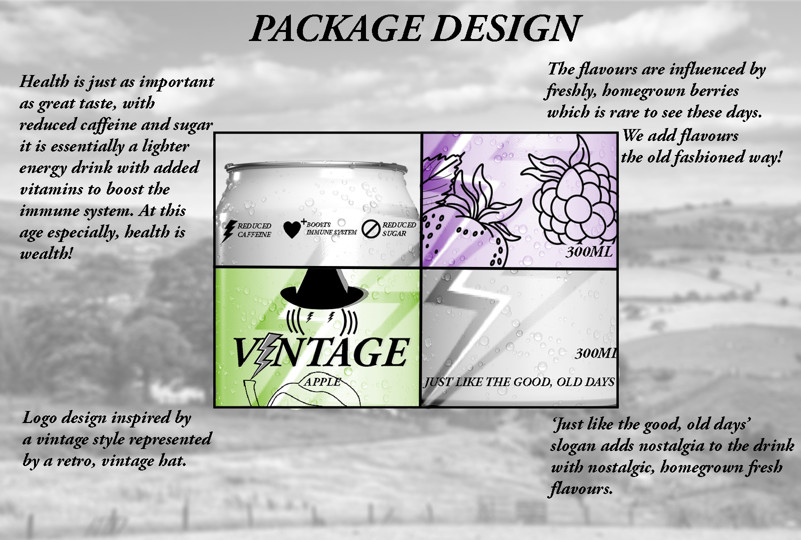
Energy drink package design
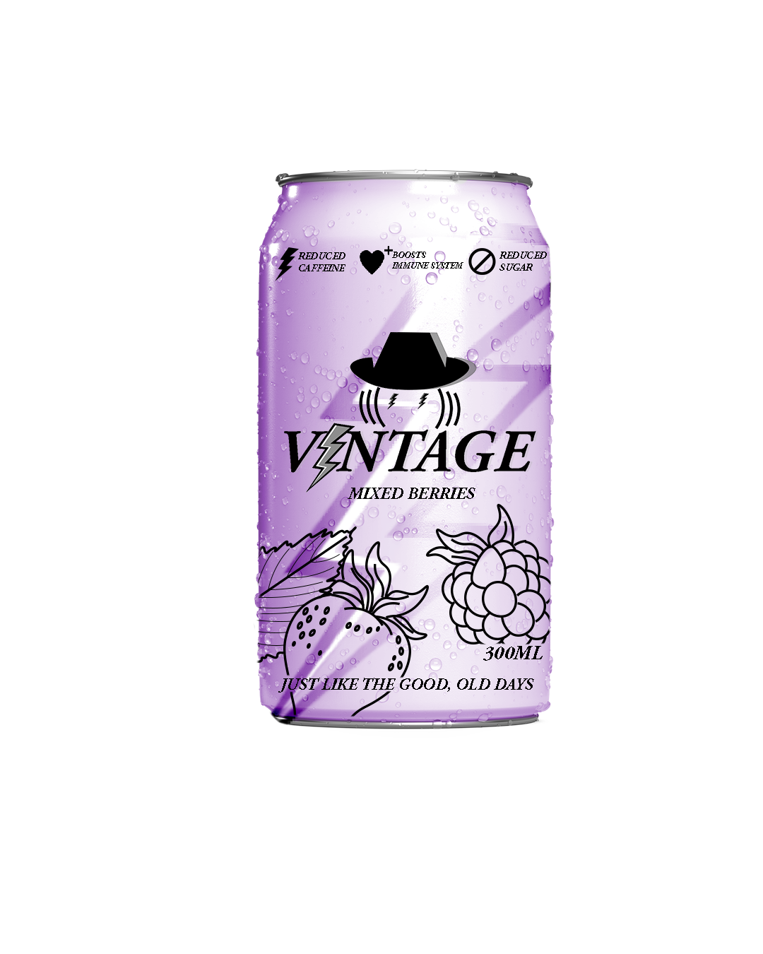
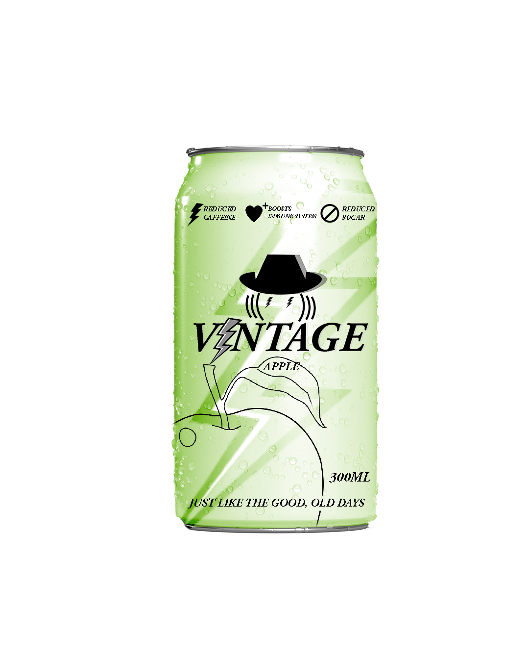
To add to the vintaged narrative, I decided to base the brand around nature, berries and apples. I tried linking this to the narrative of old people through a stereotype of the older generations growing their own berries and apples in fields and villages which is essentially the inspiration behind the three flavours of the vintage energy drinks being original, mixed berries and apple. To further enhance the idea of homegrown apples and berries I’ve used classical, old-school illustrations of the apples and berries on the packaging, I’ve tried to create the packaging as familiar as possible with the older generation by ensuring the illustrations of either apples or mixed berries are fairly large, being clearly visible on the can as many of the older people have poor eyesight therefore making important components such as the flavour illustrations large and clear can be useful for this target audience.
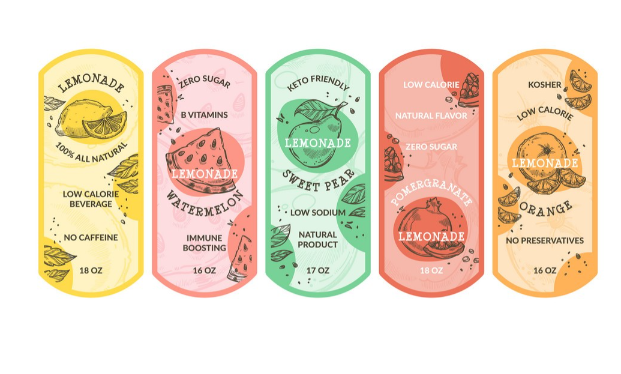
Pinterest. (n.d.). Vector Citrus Fruit Sketch Set | Fruit sketch, Fruit illustration, Citrus fruit. [online] Available at: https://www.pinterest.jp/pin/252553491582615145/ [Accessed 19 Mar. 2024].
I took the inspiration for these illustrations from this image I’ve found online which demonstrates variety of fruit flavours through a classical, old-school illustration. The features that make this illustration style unique is the sheer detail of the fruits, which I’ve attempted to recreate and publish on my packaging. The details of the leaves and other in-depth details such as strawberry seeds enhance a formal feel rather than the illustrations being funky and cartoonish which would be more appropriate for the younger generation rather than this target audience.
When it comes to colour, I have taken the same approach by giving the packaging a formal feel. I have simply done this buy lowering the saturation of the colours as there is no need for them to be too bright and stand out as much as typical energy drinks, as bright packaging is proven to be used to appeal to the younger generation. Therefore, I’ve simply taken an opposite approach through low saturated colours which are formal and appealing to the older generation.
When designing the packaging, I ensured the composition of the components worked effectively together, I obviously had the logo positioned in the middle with the slogan being at the bottom of the can, I also decided to add health benefits at the upper section of the can, I represented each of the three health benefit with an illustrated symbol such as the heart with a plus representing the boost of immune system which is especially important at an older age as health becomes more valuable with older people being more prone to health problems. I’ve also added a large lightning going through the middle and blended it with the packaging colour as lightning is commonly used to represent energy. This page essentially showcases the brand identity of the packaging in basic detail, as you can see,I’ve labelled each section of the packaging design giving a basic overview of the thinking behind the ideas, using an old-fashioned typography with the black and white blurred image of a field landscape.
Stop motion teamworking
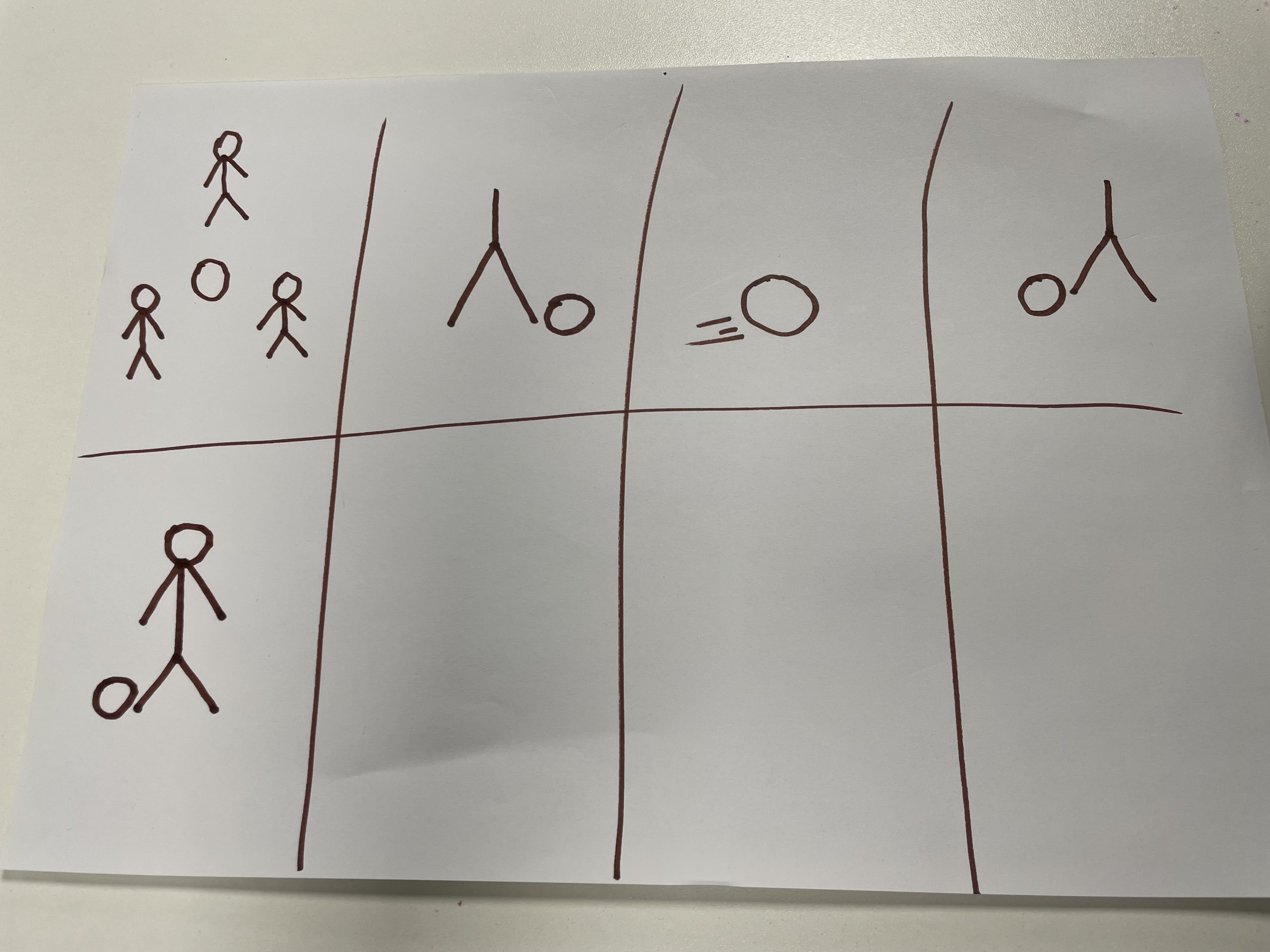
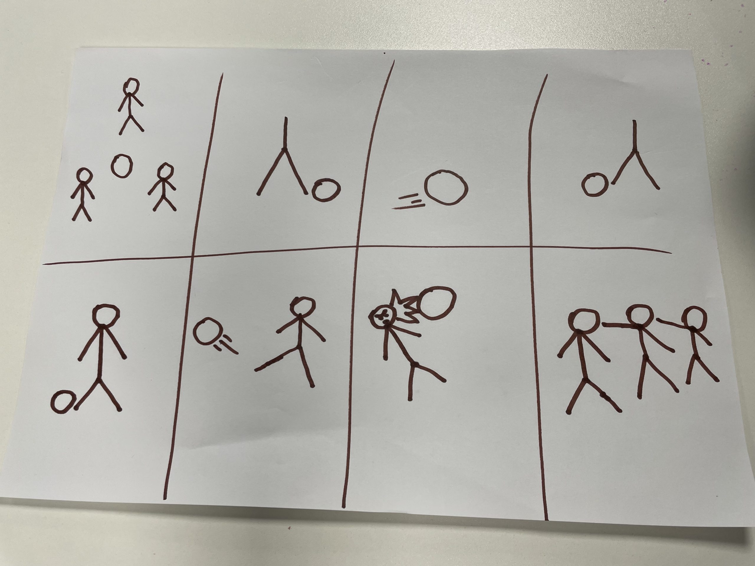
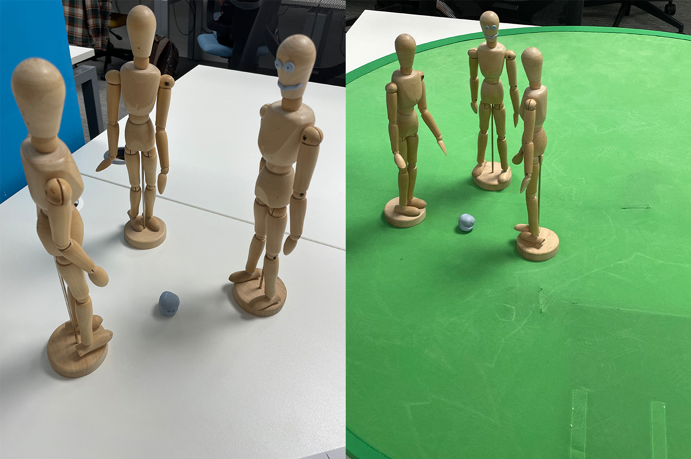
This task revolves around stop motion animation, however in this task, as a group we had to create a stop motion animation in real life with wooden sculptures we were provided with. There was a group of three of us as we were set to create 10-20 second stop motion animation of any narrative that we as a group can come up with using the assets we were given. We were provided with three basic human wooden sculptures and a wooden human hand sculpture, we decided to use all three human sculptures and create a stop motion animation piece of a brawl between three football players. We decided to use a blue tack to act as the ball, however I wanted to make the animation be linked to the theme of football more obvious by using a green screen that I’ve found in the room which acts as the grass rather than having a blank white table as the background floor for the animation. Beforehand, I took the role of sketching out a simple storyboard consisting of stickmen that we as a group discussed. The storyboard consists of variety of shots including closeup shots.
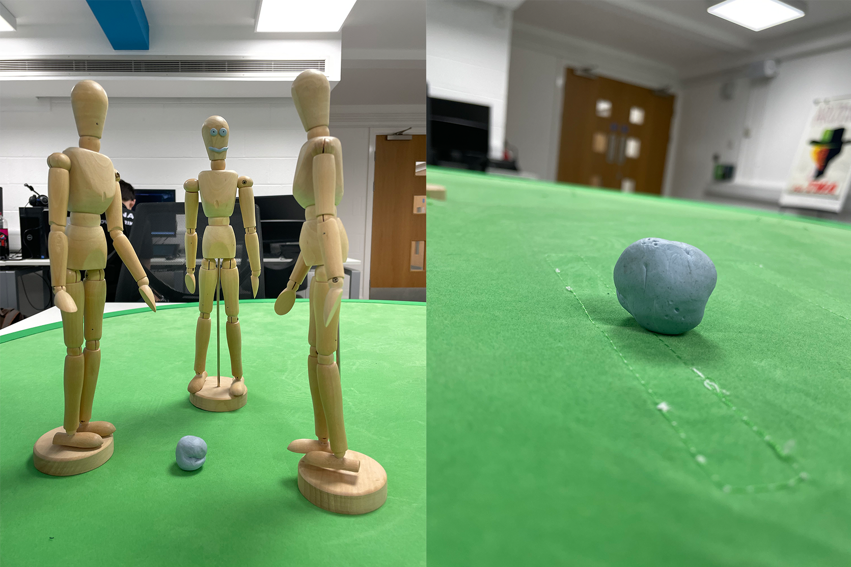
As this animation revolves around a brawl, I decided that it would be effective to add facial expressions on the sculptures using blue tack to portray emotions.
Before going into this teamworking task, my personal psychometric test results from previous teamworking task suggested that I can be a leader but not at all times, however during this teamworking activity I proved this wrong by stepping up and taking control of the task alongside another individual as we discussed, planned and took action in creating stop motion animation using the materials provided. In the beginning the group as a whole was quite conservative and didn’t bring up many ideas until me and another individual took control, as the project progressed so did the team bonding develop as pretty much everyone was contributing whether it was coming up with ideas or solutions.
Now going into detail, the animation starts off with three individuals passing the ball between each other, the shot then transitions to a closeup of a football replicated by a blue tack. The shot then goes back to the previous shot of the three individuals passing the ball around as one of them strikes the ball into the face of another individual, which sparks the brawl that is about to proceed. The individual who got his face struck by the ball then proceeds to turn and strike a punch to the individual who struck the ball at him, we then see a closeup of this as the individuals angry face expression is clearly demonstrated through the use of blue tack. As the guy gets knocked out from the punch, the third individual proceeds to punch the other one, who withstands the punch and knocks out the third individual in return.
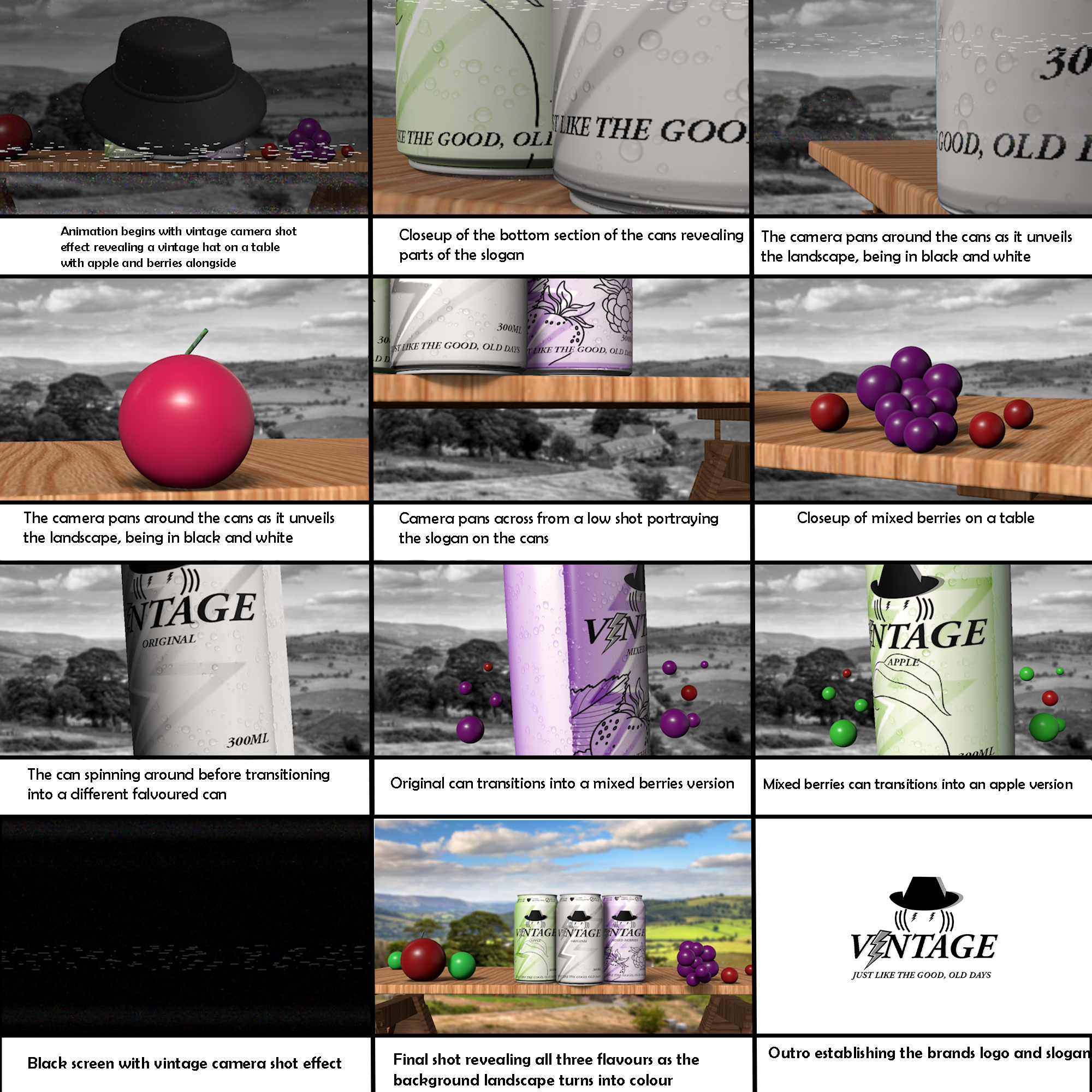
Conceptual energy drink animation storyboard
The animation starts off with vintage camera shot effect, which is essentially a distorted, glitch like effect that were common in old fashioned televisions. I decided to add this effect to my animation as it adds to the narrative of the word ‘vintage’ as the whole brand and animation revolves around an old-fashioned narrative style, with the energy drinks having the target audience of 60+. Furthermore, the shot shows an old-fashioned hat moving upwards from the table, as the old-fashioned hat is one of the main logo components of this brand, again used to enhance the ‘vintage’ narrative. The distorted camera effect continues in the next shot as the camera pans around the bottom section of the cans revealing parts of the slogan and unveiling the background landscape in black and white which is another idea I’ve incorporated to add to the ‘vintage’ narrative combined with nature as I’ve used nature to relate to the idea of homegrown apples and berries which is conveyed throughout different shots within the animation. We then see a closeup of an apple on the wooden table as the camera zooms out, like mentioned previously the shot of an apple represents one of the drink’s flavours as I’ve used this shot to build up the reveal of the drink’s flavour. The camera then pans across from a low shot portraying the slogan on the bottom section of the cans, as the next shot demonstrates a closeup of berries, similarly to the apple shot, giving the audience a hint about the mixed berries flavoured drink. The animation then shows a closeup of the original can as it spins and transitions into a mixed berries version which then transitions into an apple version essentially revealing the three flavours, to add more spark to the transitions of each flavour I’ve added 3d circles representing can droplets that match the colour of each flavour. A black screen then appears with the distorted effect returning before the final shot appears, which consists of all three flavours being presented outside on the wooden table with the background landscape coming into colour, as the apples and berries that were being unveiled earlier are also presented on the table making the connection to the drinks flavours but also the narrative of homegrown apples and berries which essentially conveys to the audience that the flavours used for the drinks are fresh and natural made in a village type environment which adds further to the theme of nature and relates back to the stereotype of the older generation growing fresh apples and berries in their own yard. To finish off the animation, I add an outro which simply establishes the brands logo and slogan. As the slogan ‘Just like the good, old days’ adds nostalgia and is a relatable saying for the older generation.
Stop Motion Energy Drink Branding Animation
References
3D hat – Bing. (n.d.). Bing. [online] Available at: https://www.bing.com/images/search?view=detailV2&ccid=tbxGkr%2FU&id=AAEE29CFDC6EB3EADBA64D7B5856AC63109A0858&thid=OIP.tbxGkr [Accessed 21 Mar. 2024].