Design Portfolio
Conceptual Design Idea:
In this assignment I’m required to create a 3D metamorphosis animation of my choice from the three choices I’ve been provided with. I decided to base my animation of a flyby of Stonehenge that is made of Swiss cheese, however there is no limit as to how much I can develop this idea providing me with creative freedom and bring any conceptual idea to life through my animation. Before establishing where I was going with my animation piece, I noted down different ideas that could potentially work, this was my first stages of planning.
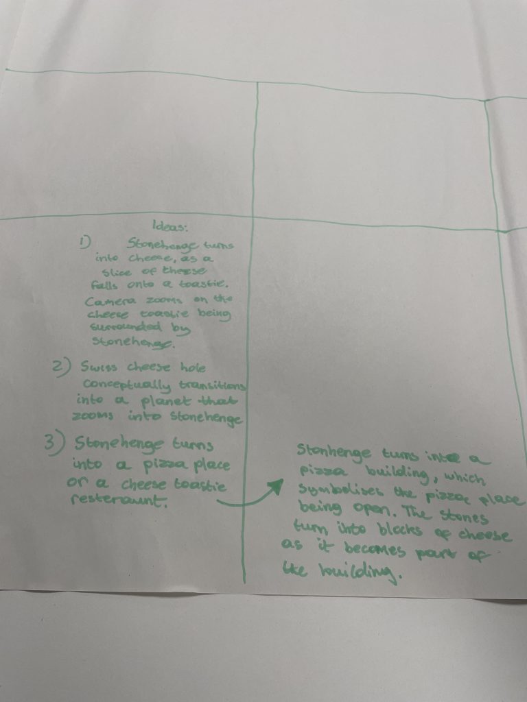
Here are my three basic ideas I have come up with straight out of the blue obviously focusing on the concept of Stonehenge and Swiss cheese, my technique for coming up with these ideas was by simply creating links between the two subjects and what they are associated with, for example in my first idea I linked the swiss cheese concept with a cheese toastie which can be seen as a very basic connection between the two however it makes sense, the initial idea is that the Stonehenge turns into blocks of swiss cheese as the slices of cheese fall onto a toastie as the camera zooms in on the toastie being surrounded by Stonehenge. I decided not to progress with this idea as I feel like it’s too basic and I can come up with something more interesting and unique, there is also no real, strong conceptual idea behind it I feel.
My second idea was the one I decided to progress with, which essentially showcases the swiss cheese as one of the holes conceptually transitions into planet earth as the camera eventually zooms into Stonehenge. At the time this was a basic idea with potential therefore I decided to progress with it and develop the idea further by adding Tufte’s five theories as I’m developing my storyboard. To give my animation more purpose and sense I decided that it needs a meaning behind the storyline which is essentially what the animation aims to achieve and portray to the audience. Therefore, I simply decided to base the animation surrounding a brand new swiss cheese brand named after Stonehenge. I decided to add this narrative as it adds more purpose and meaning behind the animation. In my Animation, I’ll have two main conceptual transitions one being at the start of the animation as the cheese slice forms into a ticket to Stonehenge, as this part of the sequence builds up and foreshadows the idea of travelling through space towards earth and arriving to the destination of the Stonehenge which also transitions straight into my second conceptual transition as one of the holes within the swiss cheese transitions into plane earth within space before the camera travels through space in the next sequence.
Finally, my final idea for the animation which I’ve rejected was the Stonehenge turning into a pizza place or a cheese toastie restaurant, I’ve used the same concept idea of the Stonehenge forming into cheese blocks that I have in my second idea that I will be incorporating in my final piece.
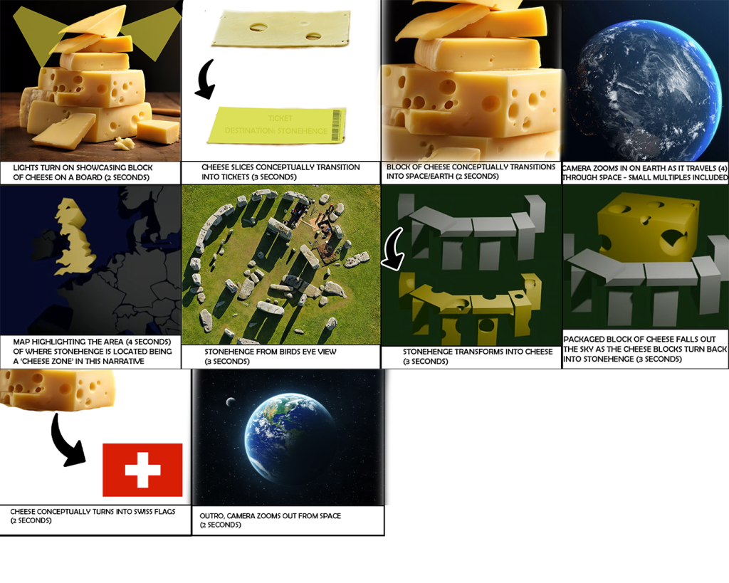
Storyboard:
The storyboard starts off with the introduction to Swiss cheese as this is the main topic the animation will revolve around. The cheese is introduced through a light switching on which reveals the cheese laying on a wooden board, shortly afterwards a cheese slice conceptually forms into a ticket which then leads onto another conceptual transition as the camera zooms through one of the holes in the cheese and emerges into space, the idea of the ticket is that it’s providing us as audience a route to a destination which is Stonehenge as stated on the ticket. Therefore, in the next scene, as an audience from a first person POV you’re travelling through space getting closer to earth. Shortly, the scene showcases a 3D map of Europe with the UK being highlighted in yellow shortly afterwards before zooming into England where in the next shot we see Stonehenge from bird’s eye view before the Stonehenge transforms into Swiss cheese before a block of cheese falls from the sky and lands in the middle surrounded by the Stonehenge. In my final two shots, I’m planning to include another conceptual transition of the Swiss cheese block forming into a Swiss flag which is a simple link between the two before the animation finished with an outro which shows the camera zoom out from space.
Visual Design Treatment:
As I’m creating and developing my animation I’m required to consider and incorporate Tufte’s five theories which are series of design theories that enhance the meaning behind certain design choices that focus on five different aspects of design. These consist of comparison of small multiples, layering and separation, use of colour, micro-macrocosm and narrative over space and time.
Tufte’s comparison of small multiples are essentially small, details such as graphics within animation or any piece that display information that enhances the meaning of what is presented to the audience, this could include graphs, labels or any sort of statistics that support the information presented. This theory is also strongly linked with colour as these small details are also used to display meaning and information effectively through colour, as colour is used effectively to provide meaning in design. A basic example of this is through sports broadcasting, score board graphics is an example of a small multiple that is used commonly in the corner or the bottom of the screen whilst broadcasting an event, the position of the graphic is very minimal in size and detail so that it doesn’t disturb the shot of the main event being portrayed on the screen. The colour is combined with the small multiples to portray information as each team has a colour palette next to their team’s name initials that is associated with the team’s colours and the colour of their jerseys, this information is useful as it let’s the audience know which team is winning or losing through the graphic, without needing to have knowledge of this sport.
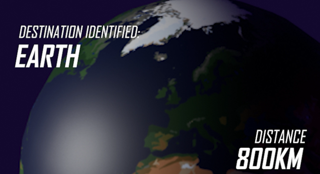
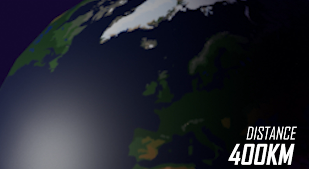
I’m planning to incorporate this theory in my work through the use of metrics on the side in the sequence of the camera travelling through space and zooming in on earth, showcasing the distance and temperature as you’re travelling through space, which kind of gives the audience a POV of traveling in this sequence supported by these small, metric displays.

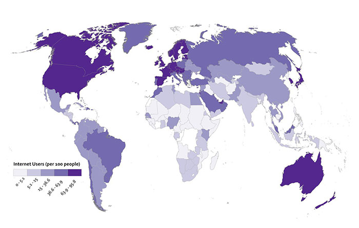
Tufte’s layering and separation is simple information displayed with a minimalistic concept of separating information into sections, which can essentially provide detailed meaning through simple composition structure combined with colour shading. This is commonly used to portray geographical information such as statistics surrounding countries or regions.
This example demonstrates effective use of Tufte’s layering and separation theory, as we can see statistics about internet users worldwide are being displayed, as separation aspect of the theory is being incorporated through a colour code to display the differences in internet users world-wide, with a stronger shade of purple meaning there are more users in a certain region.
I’m planning to incorporate this theory in my work by showcasing the map of the world as the animation sequence zooms into earth after travelling through space, and highlighting a section of the geographical map that indicates the location of Stonehenge.
Micro-Macrocosm theory is similar to the comparison of small multiples in a sense of displaying small, minimal information that plays an important design role in the bigger picture. However, this theory focuses more on the meaning behind micro design choices that eventually explains the bigger picture of certain design pieces once the concept and meaning behind these design choices are understood by the audience.
I’m planning to incorporate this theory by adding some sort of illustration that reveals the Stonehenge being presented as Swiss cheese.
Tufte’s colour theory is simple with an effective meaning behind it, his colour theory essentially states that the use of colour should be governed by ideas meaning there should be a reason for a particular use of colour as it helps to enhance the meaning of the context. For example, colours on a graph can indicate a certain level of importance and differentiate data which links back to layering and separation theory.
I’m planning to incorporate this theory in the same scene of the animation where I’ve incorporated layering and separation theory showcasing the map of Europe as the camera zooms in, similar to the layering and separation theory I’m planning to incorporate certain colours on the 3D map to portray purpose and important details in this scene.
Lastly, Tufte’s narrative space over time is essentially a story portrayed through simple variations and patterns in a short space of time. I’m planning to incorporate this theory through the use of conceptual transitions through a series of sequences that are combined to create a scene.
Final Design:
After successfully planning and eventually producing my finished 3D animation using Tufte’s five theories I’ll explain how I successfully incorporated his theories in my work with reasoning behind my decisions. Tufte’s five theories enhance meaning behind design choices that focus on five different aspects of design.
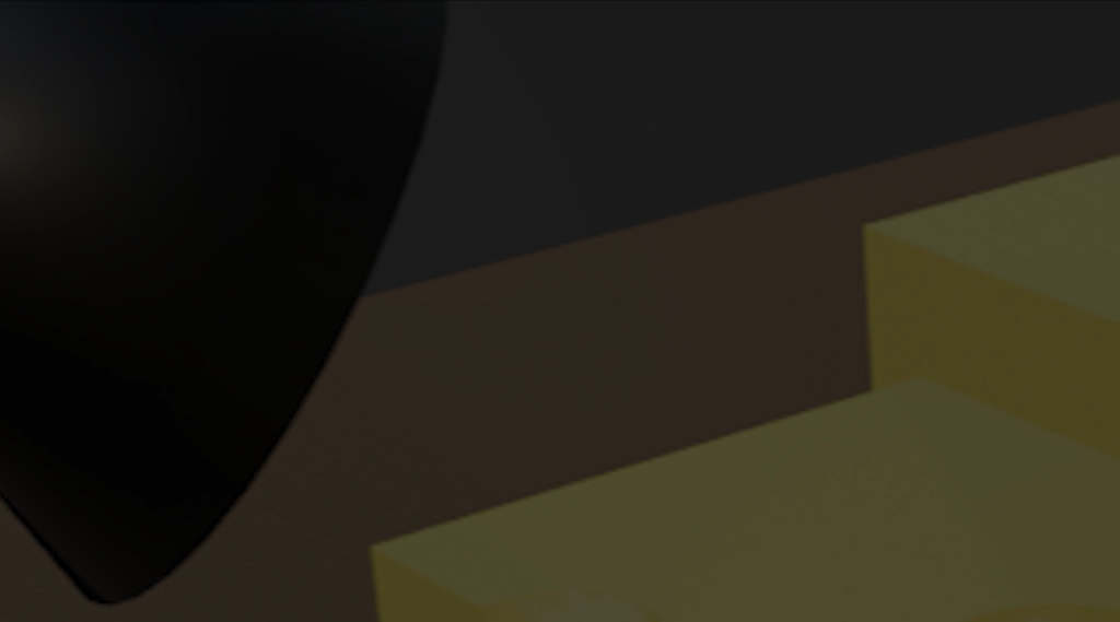
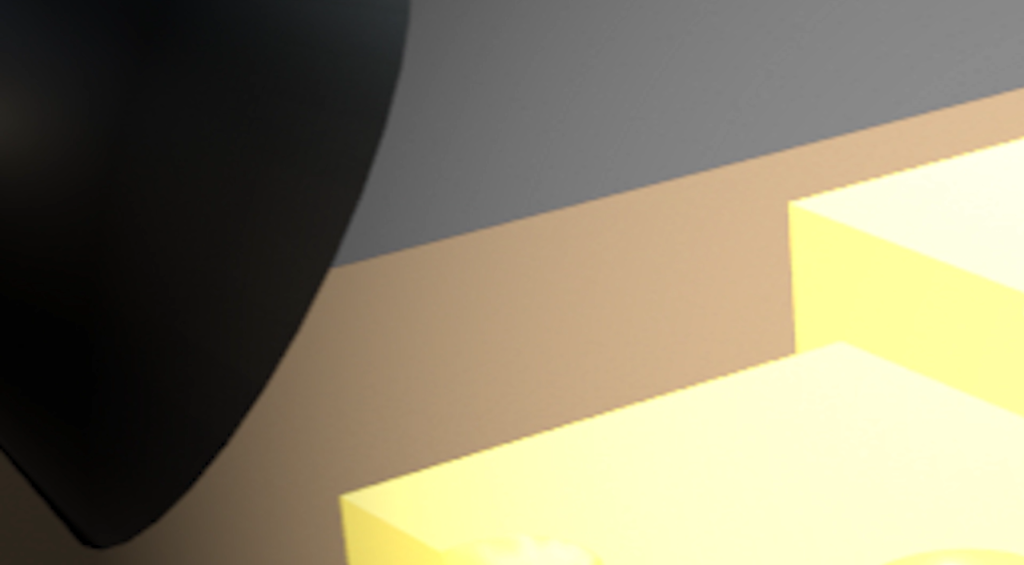
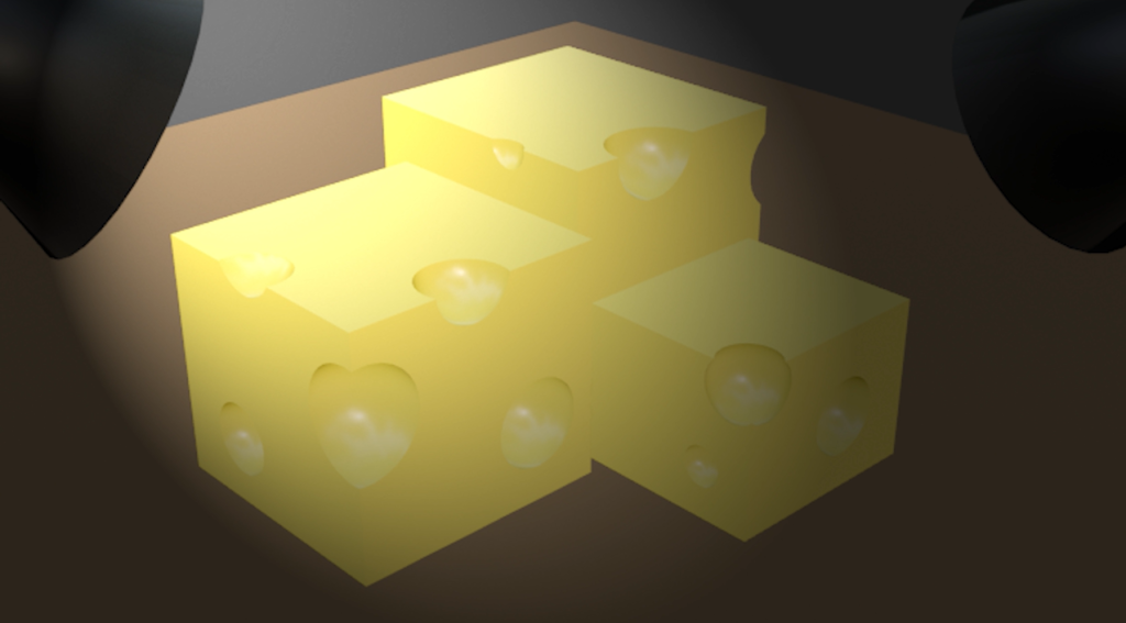
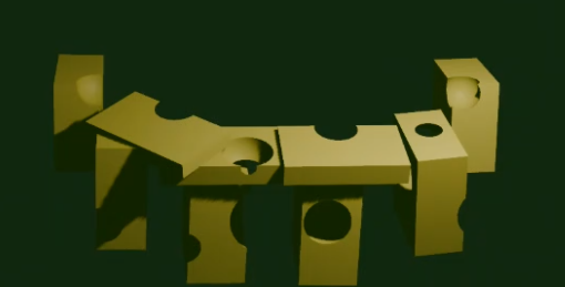
So, to begin with I straight away incorporated Tufte’s narrative space over time by revealing the cheese blocks through four different shot variations. The first establishing shot shows shadows of three blocks in a dark scenery to make the audience curious which then leads onto revealing the three blocks being the Swiss cheese. I’ve used a light effect to reveal the blocks of cheese which also creates an atmosphere.

I’ve used Tufte’s small multiples theory to convey the idea of travelling through space by including details on the side of the screen consisting of text and metric calculations, showing the distance left to reach the destination. With this scene, I was aiming to give an audience a first person POV as they’re travelling through space with relevant information being displayed on the side that is linked to an idea of travelling hence the use of distance metrics as the number changed rapidly as you’re getting closer to earth. I’ve attempted to use a futuristic type of font as it suits the narrative of space travelling.
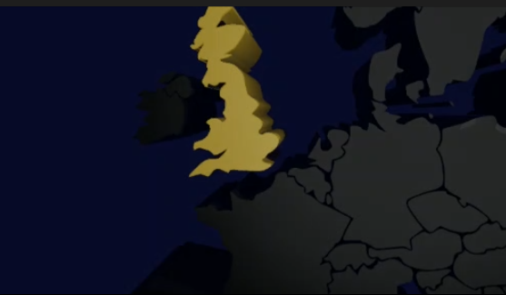
I’ve incorporated Tufte’s layering and separation theory by creating a 3D map of Europe after the camera zoomed in onto earth from travelling through space enhancing the meaning of travelling and reaching the intended destination which is what this scene is about and I’ve conveyed this through layering and separation theory incorporated through a colour code. As you can see all the 3D models of the countries are grey in colour however in the scene UK turns into yellow, whilst the rest of the nation’s stay grey portraying unimportance in this scene through the use of a darker, gloomy colour unlike bright yellow which links to the colour of Swiss cheese but most importantly it provides meaning to UK in this context conveying the final destination through separation and colour coding which is self-explanatory once seen with your own eyes. This scene also uses Tufte’s narrative space over time theory as the yellow colour sets up and prepares the audience for the next sequence through conceptual transition.
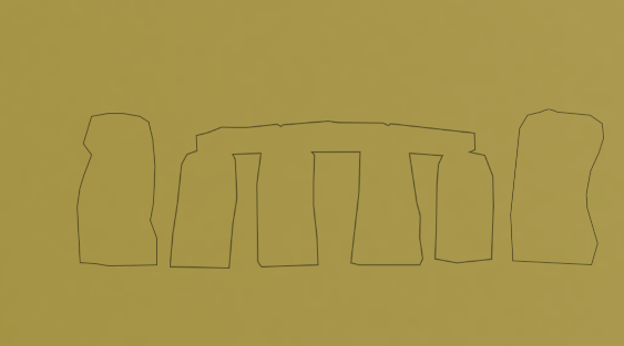
This leads onto the next sequence of the animation where I’ve incorporated Tufte’s Micro-Macrocosm theory through an illustration of Stonehenge on the yellow background as the shot is zoomed in on the yellow land of UK from the previous sequence. The illustration of Stonehenge foreshadows the next shot in the sequence which reveals the structure of Stonehenge made from Swiss cheese which has essentially been the destination. In the original storyboard we see Stonehenge being introduced from bird’s eye view however I decided to change that and instead the sequence conceptually transitions into the next shot revealing the Swiss cheese Stonehenge from the yellow background in the previous shot.
Lastly, I’ve incorporated Tufte’s colour theory into my work through layering and separation theory essentially combining the two as I’ve used colour to differentiate key detail in the 3D map sequence of the animation by highlighting the UK as yellow conveying it’s relation to Stonehenge and the importance of the location in this narrative.
3D Metamorphis Animation
References
www.storyblocks.com. (n.d.). Earth Rotating On Axis In Black Space – Stock Motion Graphics SBV-330549979 – Storyblocks. [online] Available at: https://www.storyblocks.com/video/stock/earth-rotating-on-its-axis-in-black-space—realistic-world-globe-spinning-slowly-hbkqznr-ejqjigdfg [Accessed 6 May 2024].
www.michaelfreemanphoto.com. (n.d.). Michael Freeman Photography | Stonehenge aerial. [online] Available at: http://www.michaelfreemanphoto.com/media/1cd24b26-175b-11e0-a4b8-85e01ff6ad0e-stonehenge-aerial [Accessed 4 Dec. 2020].
Freepik. (n.d.). 14,000+ Chees Pictures. [online] Available at: https://www.freepik.com/photos/chees [Accessed 6 May 2024].
Ontario Flag and Pole. (n.d.). Switzerland Flag. [online] Available at: https://ontarioflagandpole.com/product/switzerland-flag/ [Accessed 6 May 2024].
Anon, (n.d.). Interesting Facts about the Earth | Blog EBE. [online] Available at: https://englishbookgeorgia.com/blogebg/for-students-interesting-facts-about-the-earth/ [Accessed 6 May 2024].
Maps International. (n.d.). Medium Satellite Map of the World (Laminated). [online] Available at: https://www.mapsinternational.co.uk/medium-satellite-map-of-the-world-laminated.html [Accessed 8 May 2024].