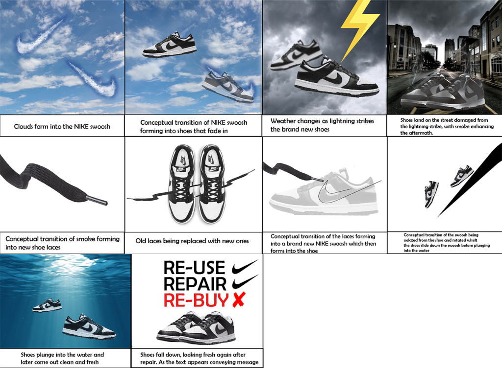
Conceptual design transition planning – Storyboard
After my research on the topic of sustainability and ethics in fashion, I’ve identified the problem and came up with a solution that I’ve demonstrated through a storyboard of a potential animation. The aim of this animation is to convince consumers to attempt to re-use and repair rather than re-invest into buying a brand-new replacement essentially reducing overconsumption of products which is the message Patagonia demonstrates in their brand marketing.
I took a creative approach to this animation with the use of conceptual transitions that builds the story up as it progresses, I have taken an approach of focusing this animation on one of the world’s most popular fashion brand ‘Nike’, specifically their shoes. The storyboard essentially shows the journey of a pair of Nike trainers with the use of conceptual transitions that essentially portray damaged shoes being repaired and re-used.
The animation starts with a sky of clouds in which the clouds then form into the Nike swoosh, straight after, the two cloudy Nike swoosh forms into the Nike shoes which are now falling through the sky. The weather changes and becomes gloomy as the fresh set of shoes get struck by a lightning. The shoes then fall down from the sky damaged, in the middle of a street with smoke enhancing from them caused by the lightning strike. The smoke then transitions and forms into a shoelace. Then the shoelace drifts off the screen and transitions from the right side of the next shot as the shoelace then forms into a basic illustration motion of a Nike swoosh. The Nike swoosh then rotates and flips, essentially becoming a slide for the shoes as they emerge into water which symbolises of the shoes being washed up as they appear to come out as clean and fresh again, this part of the animation essentially demonstrates the idea of the product being re-used as the final shot states this through typography. The animation ends with the shoes being presented as brand new again after the process of re-use and repair, I’ve used the Nike swoosh as the ‘correct’ tick next to the words of re-use and repair to push the idea visually using the brands conception. I’ve also included ‘re-buy’ as that is still an option for customers however highlighted in red with a cross next to it, implying it’s not a sustainable choice compared to other options.


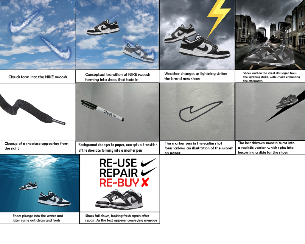
Developed storyboard:
Before finalising my animation, I have decided to make some changes to the storyline. Firstly, I’ve used original images that I have photographed myself wherever possible however the main visual change was halfway through the animation. I’ve decided to add paper background after the shoelace shot and added a narrative of illustration which is more engaging than the previous idea of a blank, white background. The shoelace forms into a marker pen as the paper background comes into the animation, which foreshadows the idea of the Nike swoosh being illustrated on paper which I’ve drawn myself, this adds more originality to my animation piece. The handrawn swoosh then forms into a realistic swoosh which I’ve created in Illustrator, as it spins and essentially turns into a slide for the shoes to plunge into water as they fall down fresh in the final shot with the relevant message demonstrated through typography.