Incorporating principles of UI/UX design and user friendly interfaces with Adobe XD
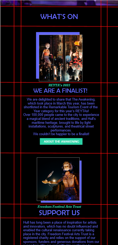
After gaining some knowledge on the basics of Adobe XD, I’ve explored the different ways I can apply UI and UX to this mock-up webpage I’ve designed. One of the main principles when creating an effective interface is composition and functionality, when focusing on creating a web layout in Adobe XD, grid system is a useful approach that can be incorporated. In this mock-up I’ve used simple tools in Adobe XD to implement a grid system, when doing so I’ve followed a basic tutorial which talked about the approach of applying grid systems to my web. I’ve simply used the shape tools to place the lines appropriately creating an appropriate grid system for my web, I’ve implemented vertical and horizontal lines across the artboard creating a proportional foundation for the web interface. When having my grid system in place, it is now easier for me to implement web elements proportionally which overall makes the web page neater demonstrating through an effective user interface that enhances the overall user experience.
When creating an effective user interface, interactive elements can enhance the overall user interface which can be implemented through Adobe XD prototyping. Interactive elements consist of basic navigation such as buttons, links and even videos which all play a part in enhancing the overall website aiming to enhance the user experience at the same time providing clear visual feedback.
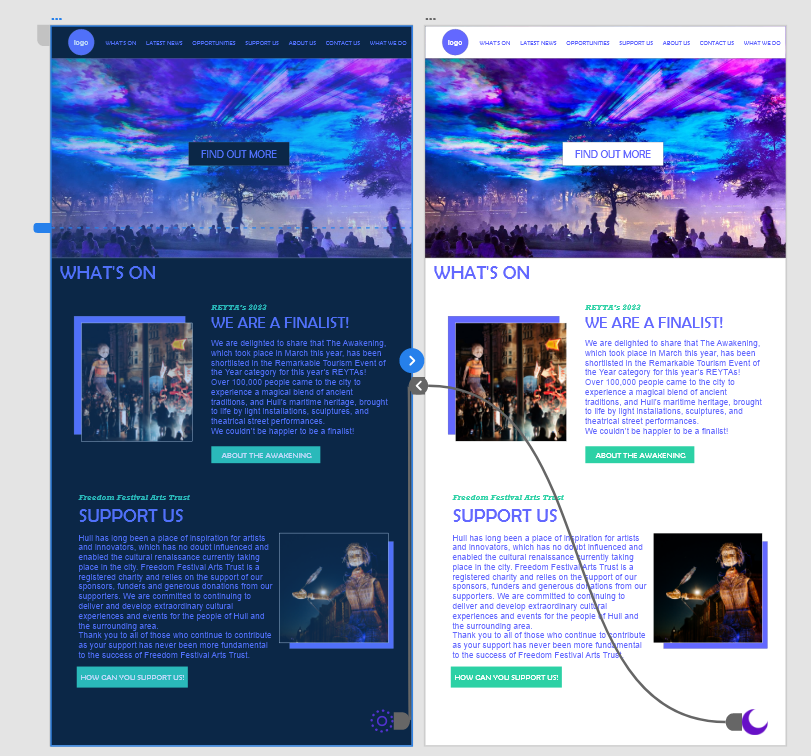
I’ve successfully managed to incorporate interactivity into my mock up website interface through the basics of prototyping alongside design choices such as iconography and colour scheme. For this mock up, I decided to demonstrate interactivity through a light/dark mode feature that I have implemented, allowing users to switch between the two different interfaces based on their personal preference.
As you can see, I simply created two artboards showcasing both versions of the web interface and simply connecting the relevant icons for this interactivity feature with each other across the two artboards. Whilst this being a mock up example, I’m planning on implementing this feature in my final design.
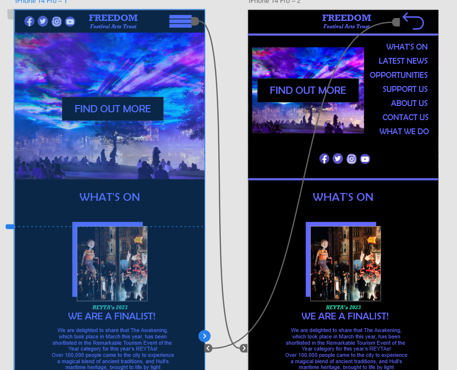
I’ve also at the same time implemented another interactive feature with this one being simpler, and more common across web interfaces which is a drop-down menu tool. One of the things I’ve learnt about incorporating UI and UX principles is that keeping information spread across webpages in a minimal way, which in this context means still having enough content with it being implemented in a simpler way. Going back to my example, the drop-down tool menu is a great feature for implementing relevant information neatly and more conveniently across the web site as all the menu headings are essentially grouped under one icon.