Detailed web wireframes using Adobe XD
When exploring web design and its principles, wireframing is an important aspect when planning and constructing a brand-new website. Wireframes is essentially a visual guide made up of rough sketches and shapes outlining the potential layout for the web. Wireframing is seen as a professional and an effective way to drive the first steps of a brand-new project, as effective as it in terms of providing web designers a visual idea and plan, it also has other benefits such as saving time for when it comes to constructing the final design so as a web designer you already have a clear picture of how the final piece should look and function through time spent on sketching out wireframes full of ideas and possibilities.
Wireframes can be presented and constructed in different ways, most commonly they can either be developed either digitally in Adobe XD for example or non-digitally which is through sketches on paper. However, I’ve created two versions so that I am comfortable working with both types of wireframes. It is also common to work with both versions of wireframing for the same project, as most web designers would start of sketching out different versions of their web layout before moving on to a digital version where they can adjust the components more precisely.
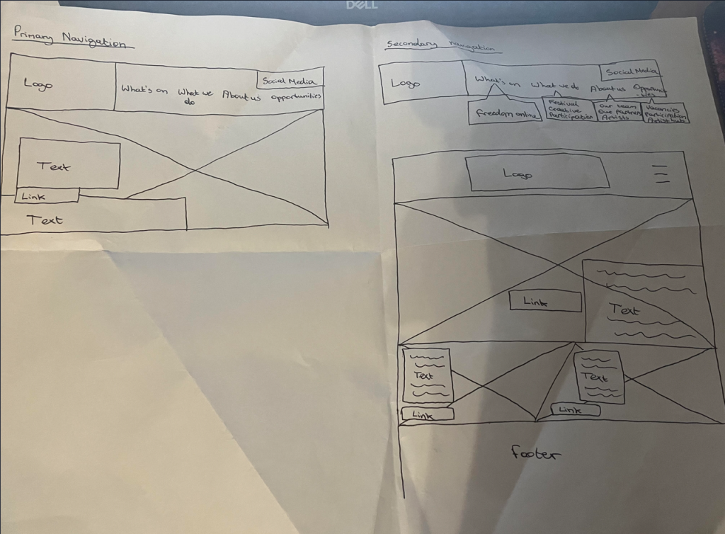
Here are my first wireframes I have sketched, demonstrating primary and secondary navigation. Firstly, primary navigation is essentially the main menu that is usually located on the front homepage of a website showcasing important, frequently accessed links whereas secondary navigation is essentially additional menus that usually link to primary navigation links such as subpages and categories serving purpose of providing additional information.
I’ve used freedom festivals current menus as a concept of developing my own rough layout for the refreshed freedom festival website I’m set to create. However, this was one of my first ever approaches for the project, experimenting with different compositional web structure and where each component could be placed on the website ensuring effective user experience. As you can see, I’ve not implemented any colour, typography or any other creative aspects as that is not essential during wireframing process. It’s important to firstly to determine the basics of the layout being composition and structure, this would make the next process easier such as applying iconography, colour and brand identity in general to the navigation and composition of the website. I’ve sketched out the wireframes by simply using blocks and boxes with minimal detail. As you can see, I’ve not implemented any proper content as this is just a wireframe, as most concepts I’ve included placeholders instead to portray where an image may be implemented on the website. I’ve symbolised an ‘image’ through a cross going across the area where the image will be showcased. This is a very simple yet effective way to demonstrate concepts of web components through wireframes. Like mentioned before, I’ve used simple labels to symbolise the basic web components such as the logo, menus, typography and links as the priority is structure and composition.
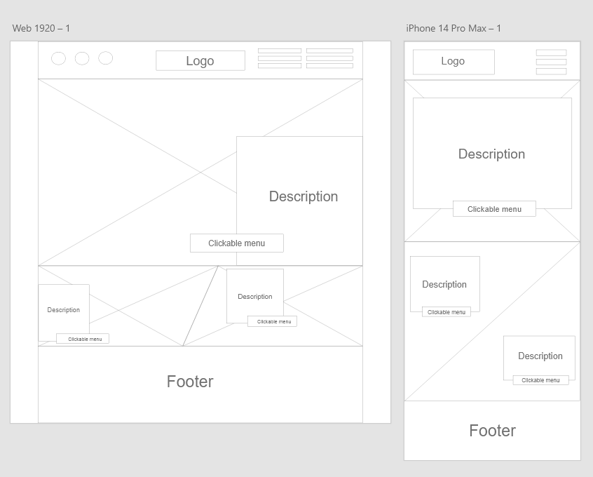
I then recreated my rough wireframe sketches into Adobe XD where I could have a clearer vision of how the layout concept will look visually in Adobe XD which is a crucial software for web design and prototyping. It’s pretty much the same as the hand drawn sketches however I’ve experimented with different composition and structure even further as wireframes are much easier and quicker to change and adjust digitally due to the tools available in Adobe XD.