The idea
I needed to come up with an idea for a mobile app which is designed for freshers. This app should help freshers to form friendship groups and get used to the new surroundings. My idea for the ‘Icebreak’ app is that it will be an interactive app that includes four different sections that will enable freshers to interact with people and participate in various events and activities in real life which will be provided through the app. My app will have a theme of social media prototype as it will have a chat feature as well as a ‘Unigram’ section which I’ve took inspiration from Instagram where freshers can post their uni experiences, get feedback and follow other students. Social media’s influence is massive these days so this would be a great way for students getting to know each other. There are also ways to meet new people offline by checking out the events and sporting activities sections where you can check the details such as time and venues for specific events and activities and meet people with similar interests.
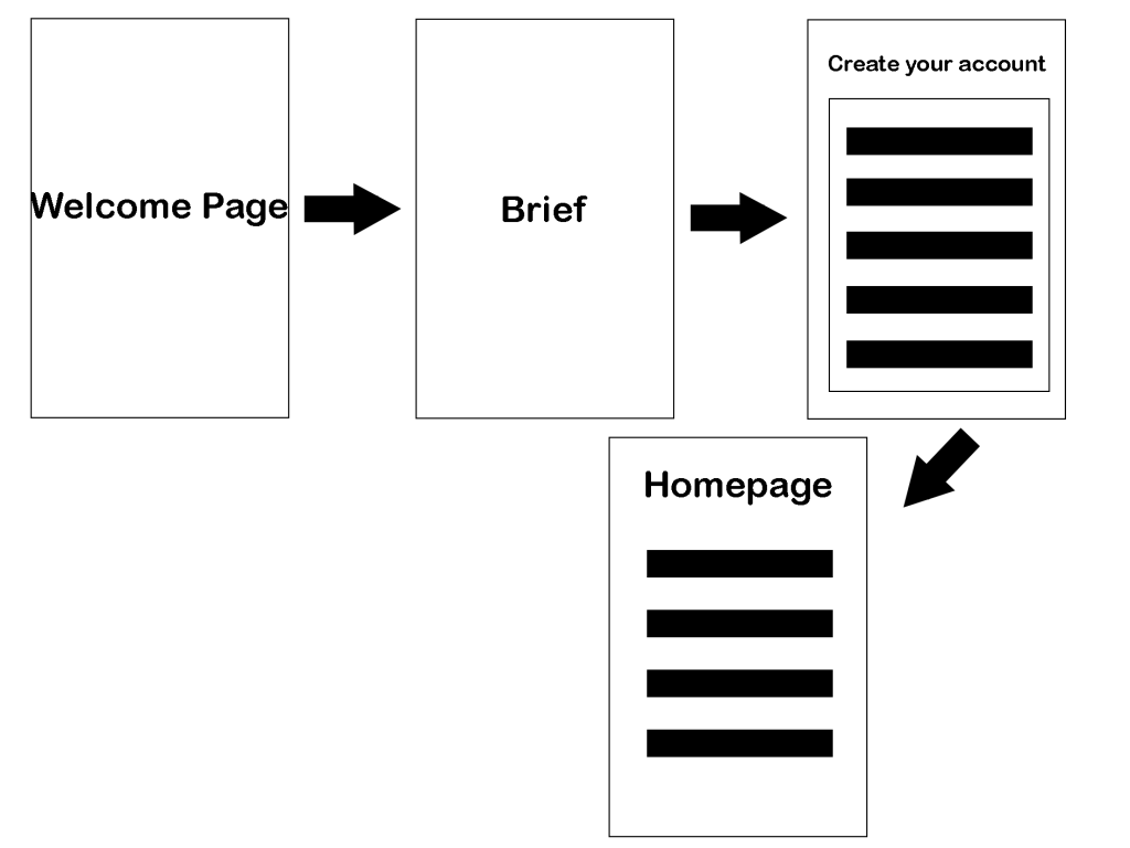
Storyboard
Design System
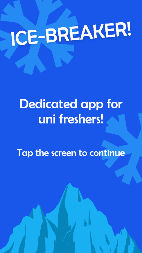
When coming up with the design idea for the app I wanted to keep it simple yet link it to the title of ‘Icebreak’. Therefore, I’ve created an original illustration of an Iceberg which would fit well with the overall design and colour pallet of the layout. I’ve also included small details such as illustrations of snowflakes to fit the narrative of ‘Ice’ and make the overall design system be aesthetically pleasing for the users through illustrations.

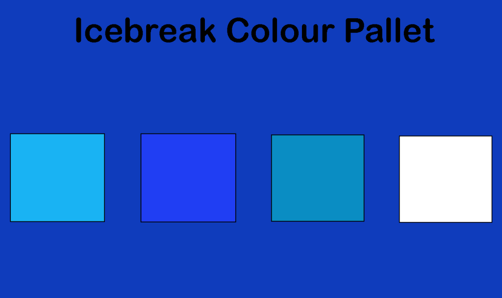
This is the colour pallet of the choices of colour I have used in my design system. Just like the illustrations, I linked the colours to link with the narrative of the app being called ‘Icebreak’. Therefore, I’ve used these three different types of blue along with the white. I’ve used the white for the text on a blue background as it fits well with the style and narrative of ‘Icebreak’. In some section I had the light blue text over the background if the background was white, as I’ve varied with the background colour across the pages.