In this post I’ll be discussing my chosen typography that is used to promote the upcoming world cup through a booklet/magazine format. Therefore, I’ve created three design pages that demonstrate typographical standards that I have chosen for this campaign. Throughout these three design pages I’ve discussed the use of font, colour and composition for the campaign.
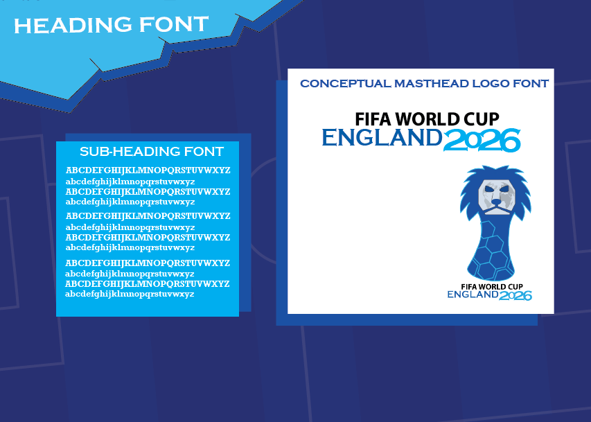
Firstly, this design page focuses on my chosen fonts that are used throughout the spread pages and the masthead logo. I’ve used the ‘Copperplate gothic bold’ font for the headings and sub-headings throughout my spread pages which is also one of the fonts used in the masthead logo. I’ve chosen this font for my headings and sub-headings as it works great with large text making sure it stands out but at the same time is easily read by the audience. It also has a sharp serif which makes the overall spread page a bit more engaging compared to if I was to use common generic fonts instead. I’ve used the ‘Rockwell bold’ font for the information text, in this design page I have demonstrated how this font is presented in both lowercase and uppercase characters as some of my spread pages present the information in either way. The ‘Rockwell bold’ bonds well with the ‘Copperplate gothic bold’ font throughout the spread pages making it look visually impressive and neat. For the masthead logo typography, I’ve used three different fonts taking inspiration from the classic world cup logo’s but adding my own flair and style to it. I’ve used the same typography composition layout that have been used in previous world cups to keep the traditional style to it. I’ve used the ‘Copperplate gothic bold’ font for the bottom text however I’ve added some creative spark to the ‘2026’ by outstretching the text making it more bulky and making sure all the numbers are connected to each other, overall making the typography of the logo have it’s own identity through a unique style.
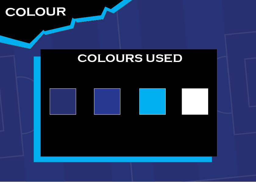
Next design page focuses on the colour that I’ve used throughout the spread pages, fonts and masthead logo. Firstly, I’ve established that navy blue and cyan will be the main colours for this campaign, the reasoning for those chosen colours links to England’s home kit which has these colours blended on the sleeves and collar. I’ve used the white colour for the typography as it is easily read-able on cyan background. As you can see this design page establishes four colours that I have used, there are two different navy-blue colours that I have used in order to create a football pitch layout as a background. I have used two different shades of navy blue to establish the typical textured grass in which I’ve done through these two navy blue colours and shapes.
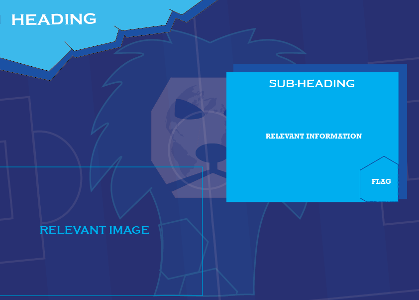
This design page demonstrates the composition of my spread pages, all the spread pages are different yet similar so this page details the basic layout of the spread pages. Firstly, all my spread pages must link with each other in some way, therefore I’ve created this 3D shape in the top left corner which is used as a background holder for my heading, I’ve decided to add a 3D effect as it really enhances my design visually. For each of the information boxes I’ve made sure they’re spread out randomly which demonstrates freedom and creativity, I’ve added another rectangular box behind the original creating a shadow stroke type effect which again enhances my design visually rather than keeping everything too simple. Simplicity can be effective in visual design however it is good to have a balance of simplicity and creative spark as I’ve ensured my spread page designs still demonstrate simplicity surrounded with some creative attributes.