This is the conceptual masthead logo that I have created for the upcoming world cup campaign in England. Before creating this logo there was quite a bit of time invested in planning and consideration of this final logo. Therefore, before crafting the logo I have sketched out my idea in a notebook to give me a rough idea of how I am going to approach constructing the logo. Firstly, I needed to have a conceptional idea of how to present this logo linking football and England together. From my sketches you can see that I was always going to use the classical world cup logo template, which is a shape of the actual cup, because the world cup is set to be in England, I have decided to have a lion as one of the main themes of this campaign. England’s national football team is known as the ‘Three Lions’ therefore I’ve wanted to implement a lion into this logo. We can see from these sketches that I came up with a way to implement a lion’s identity into the original world cup logo outline.
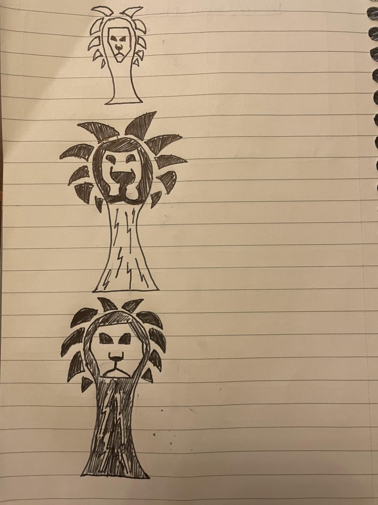
These three sketches all have the same concept however the difference between them is the detail of the lion’s face, from these sketches I have decided to use an idea from my third sketch as the lion’s face in this sketch shows a good level of structure that portrays simplicity. To make the logo conceptional and link to the world cup I have used continents of the world implemented into the logo, it was important that the continents blended well with the logo but at the same time clearly visible therefore I’ve made the continents dark grey on the lion’s face being darker white as the two-colour combinations blended well together. To create the lions face I’ve used simple shapes to create a rough, simple structure as simplicity and creative were my main targets for this logo, as well as considering composition I’ve ensured that that the shapes I’ve used to make the lion’s face were in line with each other. This campaign is represented by two main colours being blue and light blue, the reason for those chosen colours is the inspiration of England’s home kit which had a unique blue and cyan colour blended in with the basic white England home shirt. As you can see the majority of the logo is in blue as the outside strokes are cyan colour which adds a nice effect to the overall logo. To make the logo stand out more I’ve included cyan hexagon shapes which also adds a conceptional idea as the hexagons represent the shapes on a football as well as the goal net design. The reason I didn’t cover the whole logo with hexagons is because I’ve tried to create almost a fade effect with these hexagons as they appear from the sides and cut off towards the top leaving blue space.