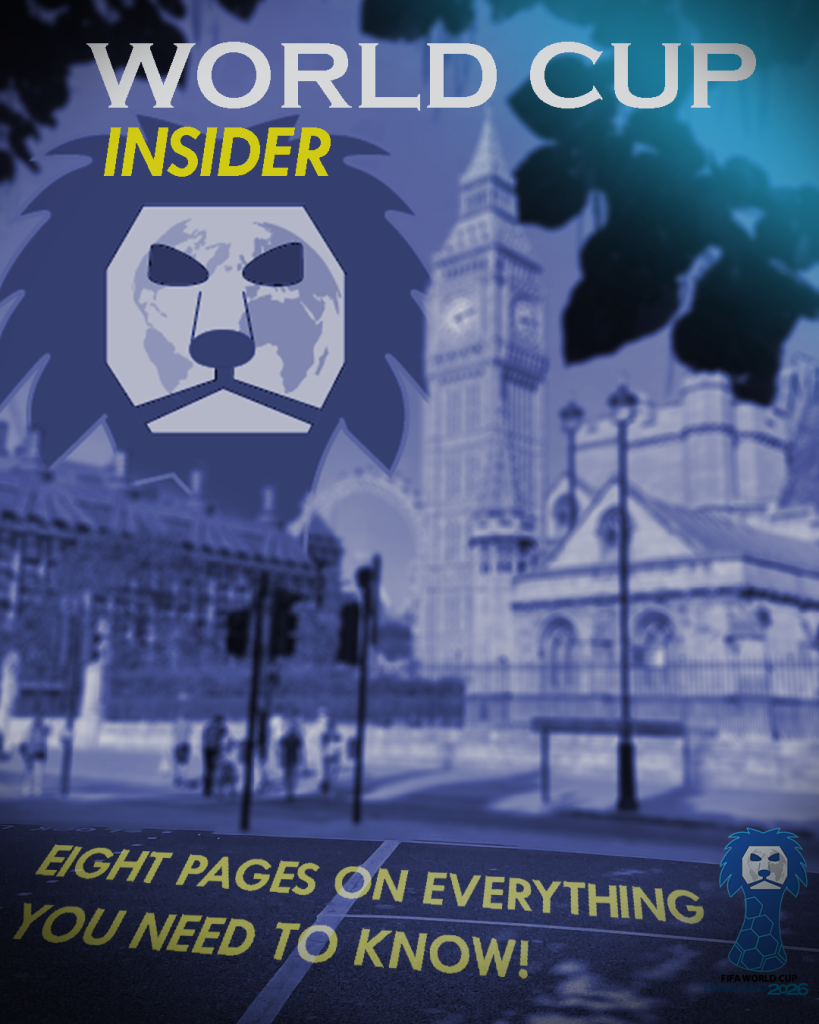
This is my first cover design, I have chosen to portray the location of the competition which is being held in England. Therefore, I’ve decided to use a photo of London that I have took myself as the main source of this cover. I have added a blur effect to the photo but kept the road pavement in focus as I have imbedded text over it, to make the cover more interesting and give it a natural look I’ve changed the perspective of the text making it seem like it’s printed on the road pavement. I’ve added a hue/saturation effect making the overall cover darkish navy blue. Another reason, I’ve chosen this photo of London is because it demonstrates great perspective and composition, as the top and it’s edges of the picture have tree leaves hanging adding a nice photographic effect. To make sure the image of London isn’t overlayed by anything, I’ve decided to fit the masthead logo behind the buildings to the left as it reveals the main part of the logo design as well as establishing the city of London clearly to the audience. Lastly, I’ve added some lighting to make the overall cover look enhancing, I’ve added cyan light projecting from the top right corner which adds a nice effect also portraying one of the main colours from the campaigns colour scheme. Finally, I’ve added some shadows in the bottom left corner of the cover.
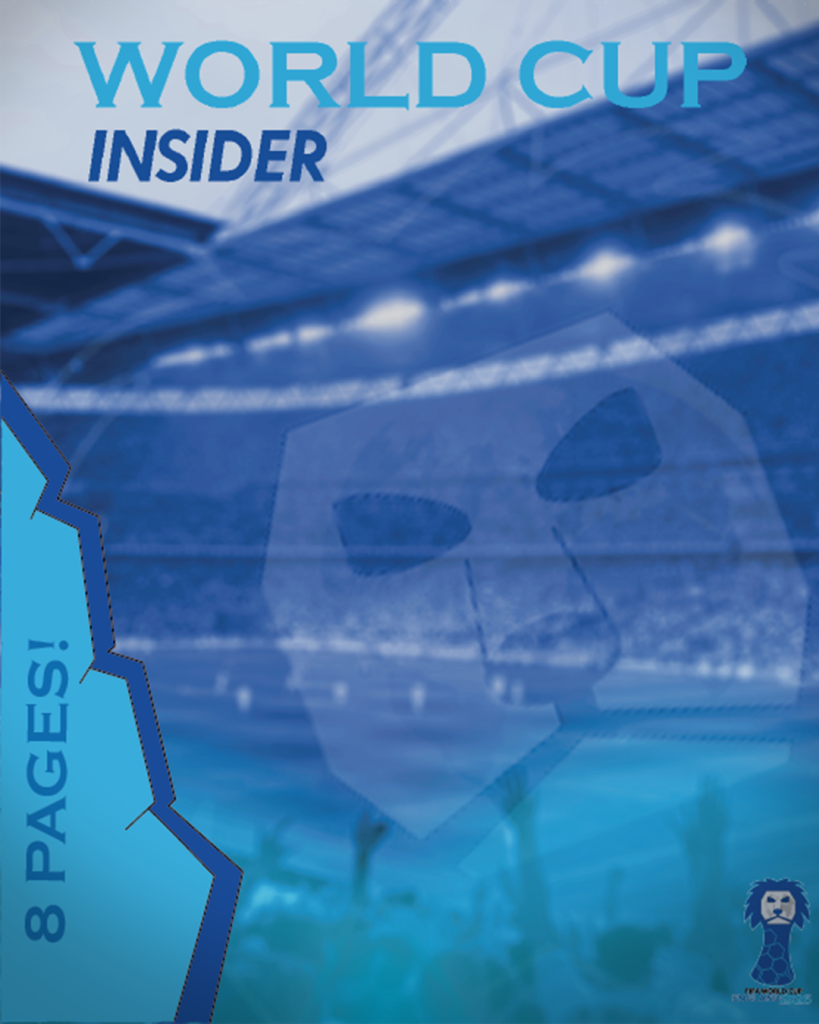
This is my second cover design, in which I have chosen a similar format of using a taken photo and crafting the design around it. Firstly, as this campaign focuses on football, I have used a photo of Wembley stadium for which I have permission to include in my work. I’ve made the cover navy blue blending it with cyan by adding some cyan lighting from the bottom which creates a nice blending effect between the two main colours that are used for the campaign. I’ve added 3D shape design on the side with established text indicating the number of pages there is in the magazine. I’ve used this 3D shape design for the headings in my spread pages and thought it would make sense to include this design in my front cover. Finally, to make the cover more interesting I have added a lion’s face from the masthead logo in lower opacity so that it blends in with the stadium background image, which overall symbolises the tournament more.
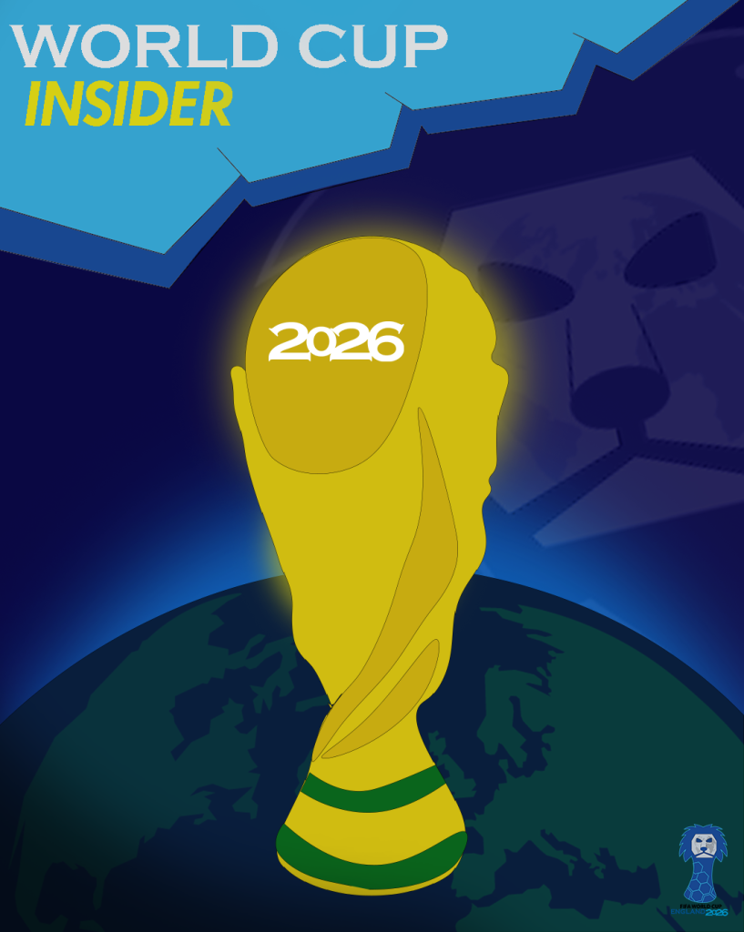
For my final cover design, I have approached this design differently to the other two. Unlike the other two covers, I haven’t used any photos to design my cover around and instead created this cover from scratch using shapes and colours. Firstly, I’ve come up with an idea to make this cover a bit more conceptual as this design focuses on the topic of the world cup, I’ve decided to illustrate the planet earth representing the world, whilst placing the cup illustration in the middle emphasising the ‘world cup’. I’ve added a light blue lighting projecting from the earth as well as adding some yellow light projecting from the trophy making it glow which adds nice visual texture to the cover. For the title, just like in my second cover and spread pages I’ve added a 3D shape effect as it works well with the cover. I’ve also added the year 2026 onto the trophy to establish the year the competition will set to start. Finally, to cover up some empty space I’ve implemented a lion’s face from the masthead logo in low opacity just like in the previous cover design.