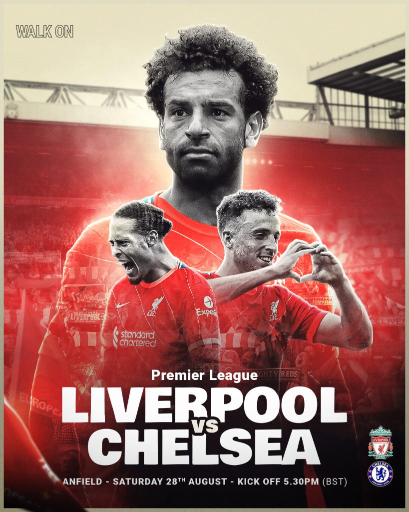
This is a matchday graphic that demonstrates effective use of composition, firstly is it important that matchday graphics portray the typography clearly as well as making the graphic look tidy which is achieved through the layout and composition. This graphic uses composition to portray the main player ahead of match, the designer has achieved this by making him the biggest one out of the three players within the design whilst the other two players are just below him. Also positioning him central makes him the main subject when the readers have a first glance at the graphic. In addition, the star player’s head is just above the stadium which makes him look superior as well as the graphic emphasising that he is the main focus for the match. The typeface is also well positioned as it is centrally in line with the main player in the graphic, the typeface is not right at the centre of the graphic so that it is not blocking the view of the main subjects of this graphic but at the same time the typeface is eye-catching and perfectly visible for the reader and positioned in the way that makes the graphic look neat and tidy overall. The typeface is also very compact as the names of the teams are also presented in a bold font making it stand out more. The stadium is positioned neatly behind the players as the designer also added a small amount of blur effect so that the main focus is on the players and the typography which is the most important part when advertising a sporting event. There is also a good composition of colour as the lower section of the graphic where the typeface is positioned made to be darker, this is to make the text clear and easy to read whilst the rest of the graphic had brighter shade of colours. However, one of the slogans was included in the top left corner on a light background, therefore rather than having a white typeface the designer has made it transparent and just included the stroke to make the slogan clear and visible.


The example I am redesigning is a Hull City matchday graphic which demonstrates a poor example of composition. Firstly, the overall graphic is very generic and uninspiring as most of the graphic is presented on a simple black background with the typeface, club logos and a small part of the stadium which is barely visible. Therefore, in my redesign, I have decided to make my graphic more football authentic by including a clear image of the stadium that covers half of the graphic neatly. The original example doesn’t portray the main player for this game effectively as he is positioned towards the side not really standing out for the audience despite being a key figure in this match. Therefore, in my redesign, I have positioned the player centrally which straight away demonstrates his significance. In addition, I have also applied some bright amber colour as to where the light would be reflected as it adds texture and realism. The original example included the main colour of the team being black and amber as it should however the layout of colours was uneven across the whole design and lacked creativity. Therefore, in my redesign, I have made the stadium image black and white and the sky being amber which makes the design much more interesting. The original example portrays a poor composition of typeface as the club logos, and separate texts are all different in size and colour which can make the graphic harder to read and makes it look disorderly. Therefore, in my redesign, I have used the same font and colour for all of the typefaces, I’ve also made the clubs logos compact with the text as they’re too disjointed in the first example which doesn’t make the graphic look neat. I’ve also made the typeface larger as it’s too small in the original example. In addition, to make the design more interesting I have created three copies of the ‘matchday’ typeface and placed them all in line behind the main player, I’ve made each of the three ‘matchday’ typefaces different transparency to create an interesting effect making it look like the typeface is fading which enhances the overall design.
References