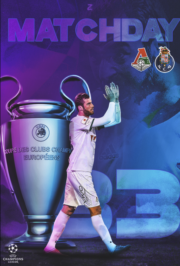
This is a champions league matchday graphic that demonstrates effective use of colour in an online editorial design. Firstly, this design uses relevant colours that go well together effectively. This is a champions league themed design in which the competitions main colours are blue and purple, these colours in particular combine well together as colours next to each other in a colour wheel tend to do so. Colour is used effectively to portray realism through shadow and light reflection, for example we could see different shades of blue and purple being reflected onto the objects, as we can see the blue colour reflection on the right side of the trophy has a combination of dark and light shades of blue portraying the colour lighting on the trophy which enhances the colour in this design effectively. The design also uses an effective proportion of colour, as we can see the two colours of purple and blue on the trophy are spread evenly with the purple reflection being on one side and the blue on the other. This could also be seen on the player in the image as he has two of these same colours reflected on him enhancing the colour in this graphic, in addition, this is a good design example as the colour reflection is not over-exaggerated and instead it is proportionally spread making it neat. Colour also contributes to the typeface in this design making the text easily readable, this is achieved through a lighter shade of the colours, for example number three is easily readable being light blue on darker blue background. We could also see the combination between the two colours corresponding in a typeface that states ‘matchday’. The colour of letters in this typeface depends on where the letters are positioned, for example the first four letters in this typeface are light purple due to the background colour on that side featuring the purple colour compared to the rest of the letters transitioning smoothly into a lighter blue being on the side focusing more on the blue colour.


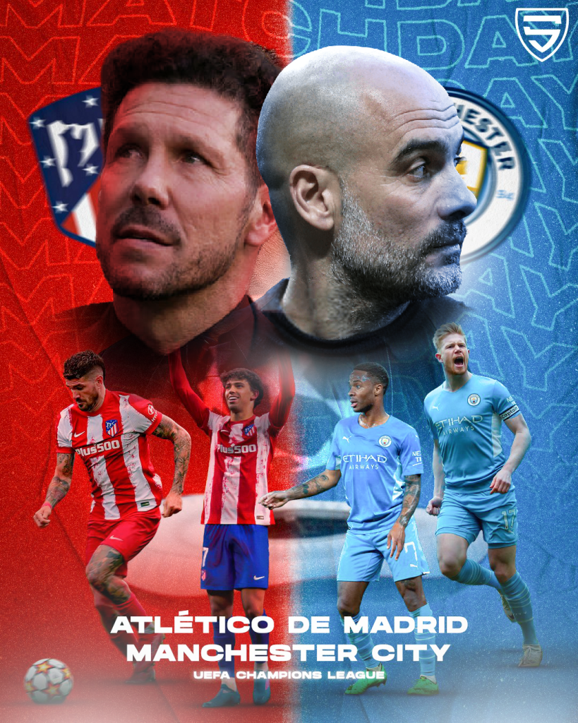
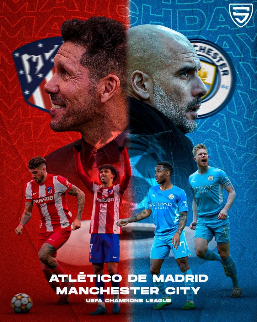
The example I have redesigned demonstrates a poor use of colour in an online editorial design. There is no problem with the choice of colour and how the colour is proportionally presented throughout the matchday graphic however the chosen shade of the colour and the way it is implemented doesn’t look good making the graphic less enhancing. Therefore, in my redesign I have changed the background colour of red and blue too warmer and brighter versions making the design less dull and more enhancing whereas with darker shades of the chosen colours the graphic looks uninspiring. This is important as matchday graphics need to look inspiring as it is a promotional type of design therefore it needs to be eye catching for the readers in which colour plays a huge part ensuring matchday graphics are enhancing. Furthermore, I believe that the designer has over exaggerated with the use of colour, in my opinion the way the designer added colour to both managers doesn’t make them look enhancing as the same dark background colour is implemented onto the managers making them look uninspiring rather than stand out. Therefore, I have changed the way colour is presented on both managers by not implementing the colour on their whole face and instead proportionally adding colour as to where the light will be reflected onto them, this adds a nicer texture and realism to my design. It is important players and managers are presented in an enhancing way that makes them stand out with matchday graphics in which this design has failed to achieve. Finally, to finish off my redesign I have included small amounts light at the bottom of my graphic which enhances the whole graphic. Overall, I have redesigned the example by using brighter and warmer colours as well as the use of colour texture on the main subjects in the graphic making the overall graphic look engaging.
References:

